Portfolio and Case Studies
4ourth Mobile and Steven Hoober are as good as the same thing. Much of my skill and expertise is in bringing out the best from a team so whether I drew it all or just guided and was the final word on design, this is all work I was involved in, that I can share.
I did a lot more stuff, but it’s a lot plus NDAs. If you need some specific experience just ask, and I will tell you if I am familiar with that sort of work, or your domain.
You can also see my experience see my pages on print graphic design, illustration, product packaging, etc and industrial design.
The items shown on this page are by no means a complete accounting of all the projects I have worked on, so if there is any gap in my experience, just ask; I might have done that also.
For a slightly more full list of content I worked on, and to browse as text instead of thumbnails, try this instead, in approximate order from oldest to newest:
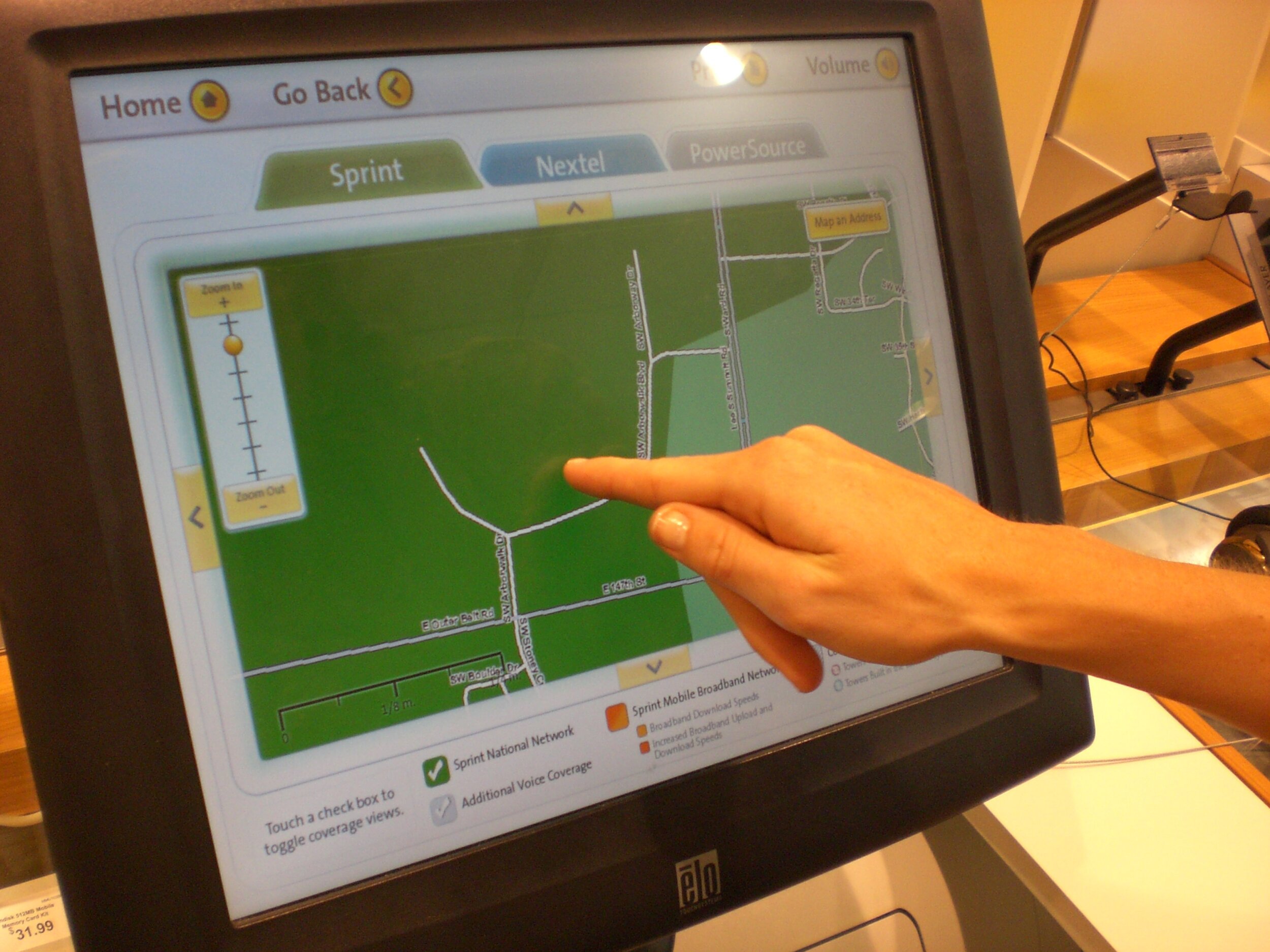
First Mobile Web in North America (Sprint)
First Mobile Search (Sprint)
First Multi-Channel Design (Sprint)
First App Store, and Music Stores (Sprint)
Two-Way SMS Web Tool (Sprint)
Mobile Greeting Cards (Hallmark)
Greeting Card Print on Demand (Hallmark)
eReader Ecosystem (Copia)
Mobile Design System (Sprint)
Mobile Web Browsers (Bolt, Thunderhawk, Croozer, Skyfire, and Samsung Dolfin)
Future Strategy White Papers (Qualcomm)
Data-Centric Websites (Bank Midwest, IGLTA)
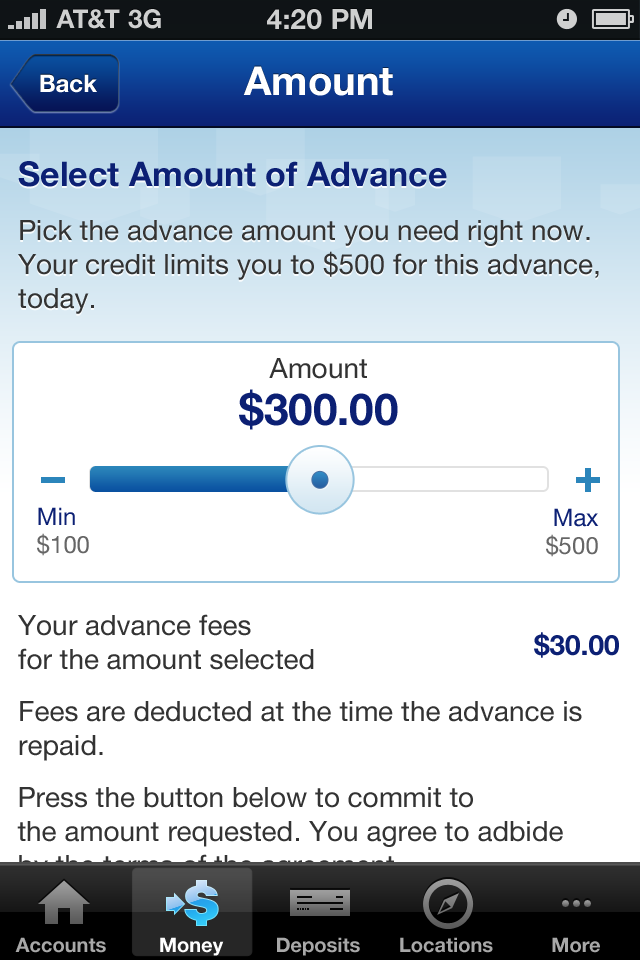
Mobile and SMS Consumer Banking (US Bank)
Personalized Home Improvement Experience (My Lowe’s)
Test Driver Portal (Roush)
Corporate Digital Design System (Cummins)
Smart Connected Wearable (Trellie)
Mobile Operator Services (TA-Telecom)
Electrical System Control Panels (Cummins Power Systems)
Engine Monitoring and Service Tools (Cummins)
Doctor Visit Take Home Instructions (What the Doctor Said)
Cybersecurity & DRM Management Portal (Verimatrix)
First Mobile Web in North America
2001
What is the mobile Internet? This wasn't such an easy question to answer in 2001. There were no pattern libraries, no existing use to observe, and the technology service providers we had to use barely understood what the point was, so we argued and worked around many technology issues.
For example, many phones were still black and white, and this is before any device detection, so it all simply had to work for every device.
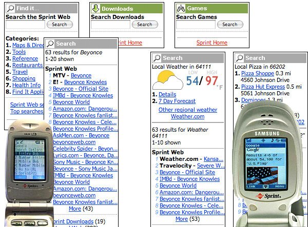
First Mobile Search
2001, 2002
One of the first, most interesting, and most regularly-revised features was mobile search. This was first provided by Google (left), but Google was apparently uninterested in mobile so I personally did all the design, in about 4 days. Later, there were revisions to this, and a change of provider to some no-name who disappeared in the interval anyway, and we continued the work.
To the right is work continued from the redesign, applied in part when Google came back on board after less than a year. The wireframes are all about parametric search, revealing more information pre-emptively, and more useful results information (such as distance for geographic results, several years before online maps were mainstream). The photo to the right is the more graphically-intensive Google results including images and so on, just after this design.
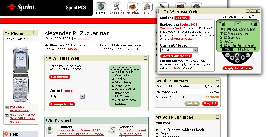
First Multi-Channel Design
2001
Before we even knew it was unique or worthy of a name, I and my team developed from basic principles the concept that account management needs to happen as equitably as possible on all the customer’s connected platforms. That means the website functions need to work on the text experience built into the Wireless Web mobile phones.
The example above was from the first version, and shows a way for users to control what was on the "home deck" of their Wireless Web experience. It also shows how the phone interface looked at that time.
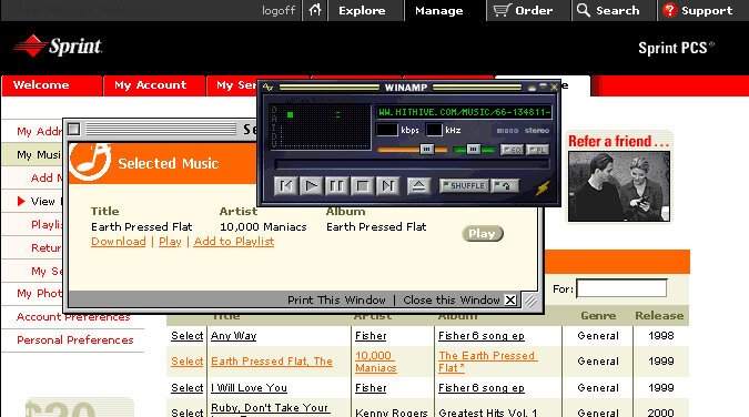
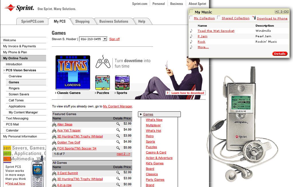
First App Store, and Music Stores
2001
One of the major things users wanted to do was download content, and expand the functionality of their devices. So I helped design one of the first app stores anywhere, maybe the first mobile centric app store, and certainly the first functional one in the U.S. It started selling ringtones, then moved into applications (for featurephones), subscription services, and other products. Of course we designed it to handle all this from the start, so expansion was easy when the content arrived. The popup above, and the entire page below, focus on music. Another key function (launched first as an independent product due to partnerships with a vendor) was to sell and manage complete MP3 tracks, which went on the Samsung Uproar M-100, the first MP3 phone anywhere (yes, even Japan). It was... not a success. And the vendor solution was clunky, but we did it and whether the designs I used were emulated or we all simply came up with the right answer independently, all the music, ringtone and app stores today look an awful lot like this still in many ways.
The music player floating over the top on the right was an existing product (WinAmp) and it’s design is not something I had anything to do with.
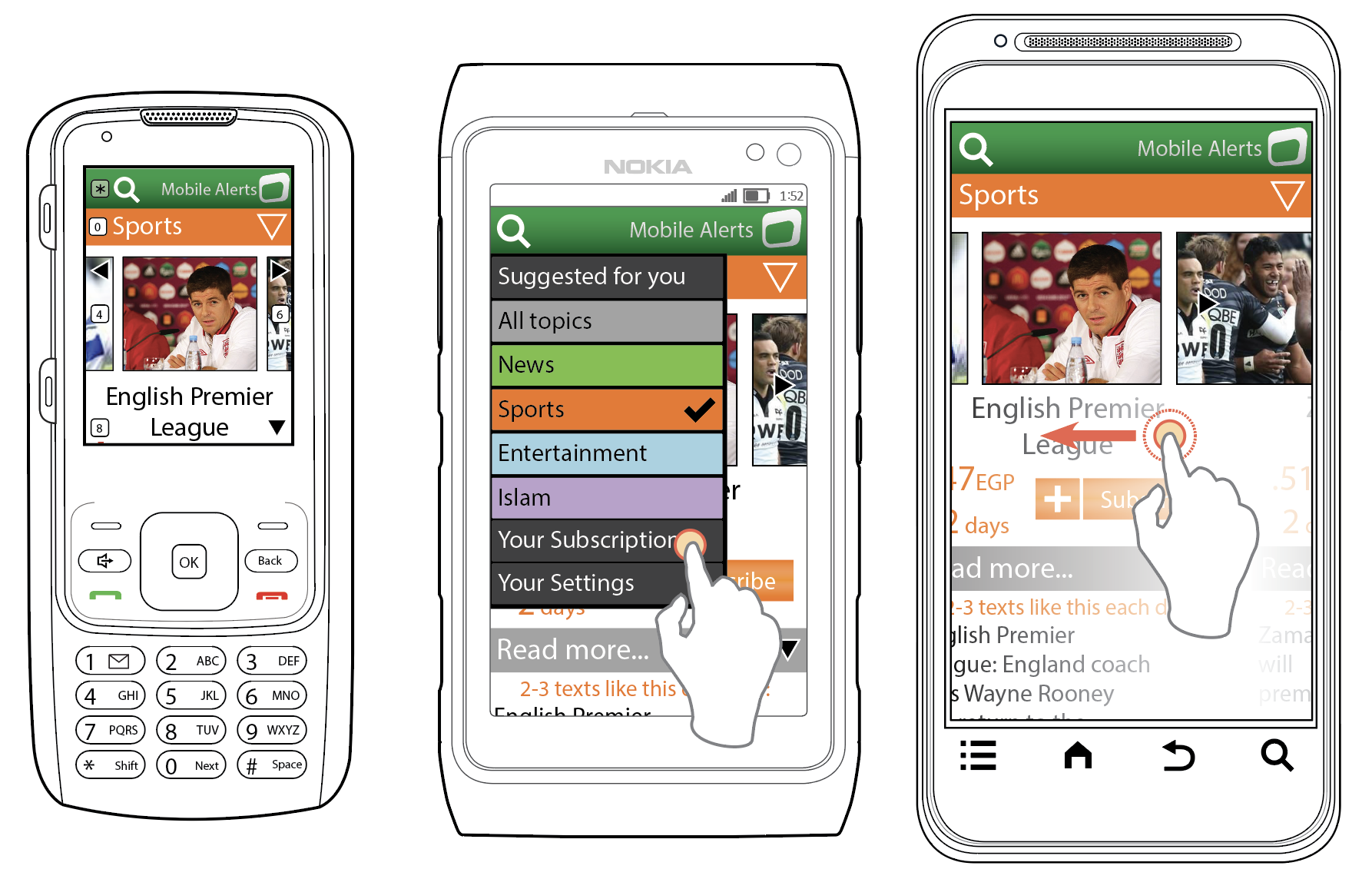
Two-Way SMS (Text Messaging)
2003, 2005
Back in the pre smartphone era, we were really happy with the ability for SMS text messaging to be our phone messaging tool. So much that most mobile operators had open access web tools to send an SMS to any phone on their network.
(Note, these documents are old. The Time New Roman text is an error in the file rendering).
I took over a nearly complete revision of the project to “finish it off” and simply refused. It was a mess. Over 50 dialogs that popped up to tell the user they had pressed the wrong button. I did a clean sheet design in about 2 weeks, which had not only almost no errors, but no help.
This service was used tens of millions of times a day, with no problems. We closely monitored the Customer Service department for issues to fix, and this product never appeared.
The Invisible CAPTCHA
Okay, one thing did come up. A few months post-launch, the security team came to tell us to add a visual CAPTCHA. I said, nope, not doing that, so explain why you need it. Turned out there were evil eastern-European bots sending spam to our customers. Within hours I had discovered they were sending thousands of messages a second. Which is faster than humans type. I put a stopwatch on a half dozen of my team members, picked a likely-fastest time, and we simply blocked new-message submission faster than that.
This worked. It ruined the financial model upon which the spambots worked, without the user being burdened, or even being made aware of it.
Mobile Telecom Sales and Account Management
2000 - 2006
I was the lead designer for a team that grew to about 12, and worked on products across the Sprint corporate environment. We performed IA, IxD, and ID, and worked with a research team, writers, producers, and a UI/Visual design team.
Among many, many, many smaller projects to improve them over time, I led complete redesigns for the consumer website from both sales and marketing to the account management side. We also designed or coordinated with paper (e.g. billing, bill inserts), in-store kiosk, mobile, and SMS response systems for a complete, integrated experience.
Many things we did were first, and copied by others in following years. From leapfrogging the state of the art with interactive service maps to the overall concepts of structuring account services, we did lots of usability research and created a set of best practices that met corporate goals for customer satisfaction, customer retention, and sales, pretty much every time.
Mobile Greeting Cards (Hallmark)
2008
By the mid-2000s it was clear the digital revolution was ruining the traditional paper based communications market. Hallmark had not yet seen their greeting card sales fall off, but were smart, and wanted to get ahead of it.
We designed the sending and receiving services as robustly different products, to avoid too much burden on recipients installing software to view.
They also realized what my team at the time — as one of the few mobile-specific design studios at the time — already knew, that mobile was the future. We worked closely with them, and a pre-selected technology provider, create a mobile-generated (with desktop web) and mobile-delivered greeting card system, that had the DNA of their paper products, and was not a me-too eGreeting service.
These are wireframe-level work because Hallmark has very good graphic designers on hand. With our guidance, even not being digital-specific, they were able to turn this into a very usable and well-branded product.
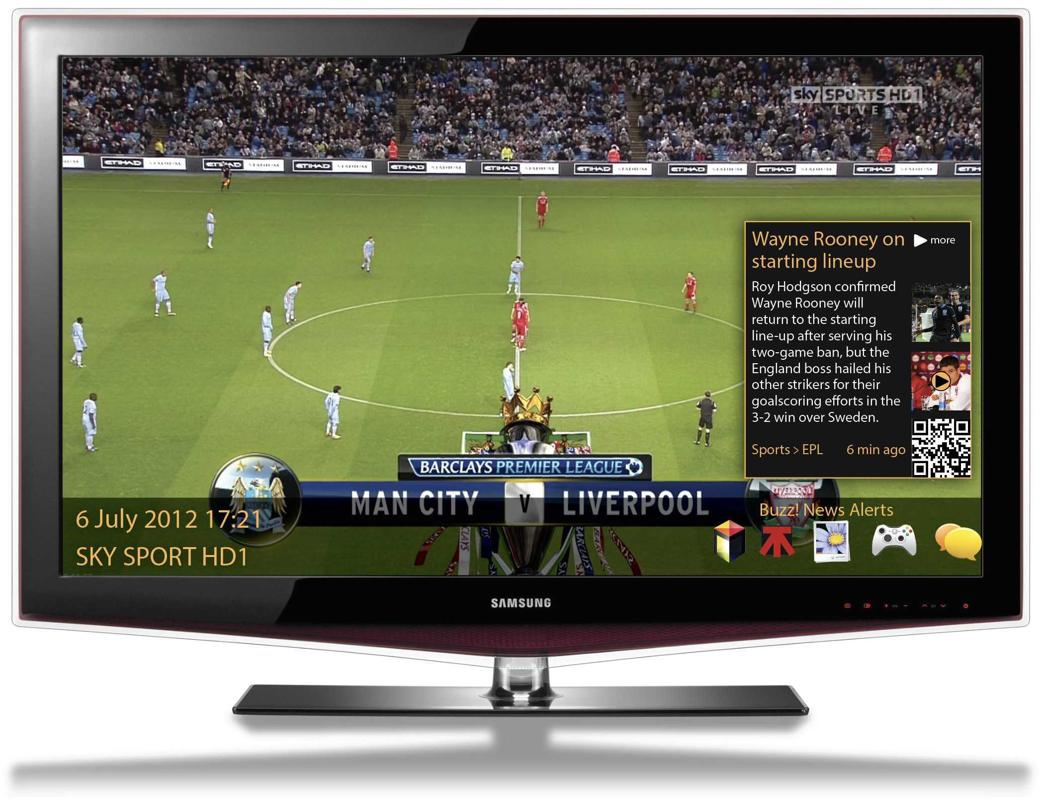
Weather.com
2008
In late 2008 the Weather Channel approached us to design an all new mobile Web experience. Formed as a cable TV channel, they put great stock into analytics, and approached us with specific problems with their existing site, and goals for any redesign.

They were an easy client to work with in many ways, requiring no convincing at all that everything on the desktop web needed to be on the mobile. Their own stats showed that with their huge user base, even niche products had enough traffic to drive useful traffic, and hence ad revenue.
I was given free rein to develop an all new architecture, driven by user needs based on analytics, and organizational demands for content availability and promotion.

This is a great example of a site far, far too large to design each page. In addition, we were just an agency without a promise of long-term consulting; The Weather Channel would need to maintain it over time.
I developed a modular framework, allowing authoring to mix and match for whatever content was available.


Large audiences mean that not only is all content important, but every type of user and every device has to be considered. In the years before the iPad, I designed for three scales: a featurephone, an old-style smartphone (Symbian, Blackberry) and modern smartphones (iPhone, but also some of those Android things).
These were not hard and fast breakpoints, but used feature detection to load the proper module based on a mix of size, touch, and most of all full javascript support. Back then, many mobile browsers supported script execution robustly, but only at page load.
This attention to scale extended to each module, and in ways much more advanced than even contemporary responsive design allows for.
Data re-flowed, with not just more width and less wrapping, but more actual details available (such as more columns) on larger devices. In the end, it was a mixed success. We handily met targets and the client was happy with the results. On the other hand, the internal development team was somehow convinced phones didn't support css, so coded mostly as table based layouts. Despite this, our guidance beat the page-size goal (I believe most pages were 14kb or less) and they handily met performance objectives.
The Weather Channel continued to be among the most visited mobile sites in North America, and at the end of this design life, Weather.com was one of the first big organizations to announce they had more mobile traffic than desktop.
It was replaced after several years by a new design, but parts of it still seem to be used for featurephones, and many of the icons and parts of the structure were adopted for the separately-developed mobile app I otherwise had nothing to do with.

Greeting Card Print on Demand (Hallmark)
2009
Hallmark wanted to upgrade a somewhat old, in-store, print-on demand service, to enable customers to create from home then pick up in store.
Because at the time they had few or no UX types, so we brought the digital expertise and the IA/ID to it.
I and my team helped them work out the concept, in a very “Design Sprint” way without the needless overhead, by performing a visit to a Hallmark store with them, and a two day offsite workshop to organize our observations, and their needs.


We created a research report, a set of design principles and I drew an architecture and some wireframe-level templates for key pages, with many annotations. It didn’t get more detailed than this because Hallmark as very good graphic designers who were able to take this work and run with it.
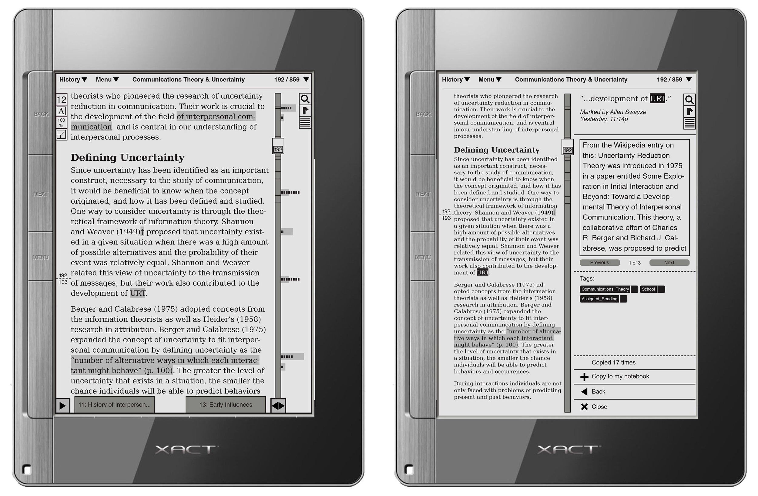
eReader Ecosystem
2009
Copia is a social digital reading platform, originally designed to be centered around ePaper/eInk hardware, but also available in other channels.
My team was engaged to provide UX/IA/IxD direction for the digital agency contracted to develop the platform. I led the creation of design principles and the development of an IA for the whole platform, as part of a multi-disciplinary team at the agency.

In collaboration with creative and development teams, I then led my team in the design of a complete set of interaction designs for an eReader (never launched), desktop web, desktop application, and mobile products.
Even the simplest stuff was complex. What is a "page" in a digital book? Current eBooks used complex, technical references which had no real world analogue. This describes a model for page display, and page interaction.

We did this before there were iPads and other easily-modifiable tablets, so to mock up designs I made a plywood tablet, which we could sketch on (the white part is whiteboard paint), or put half sheets of paper in to check out printed designs on a piece of hardware, of sorts. (On the Macbook is the legend for an encoding system used in developing the information architecture).

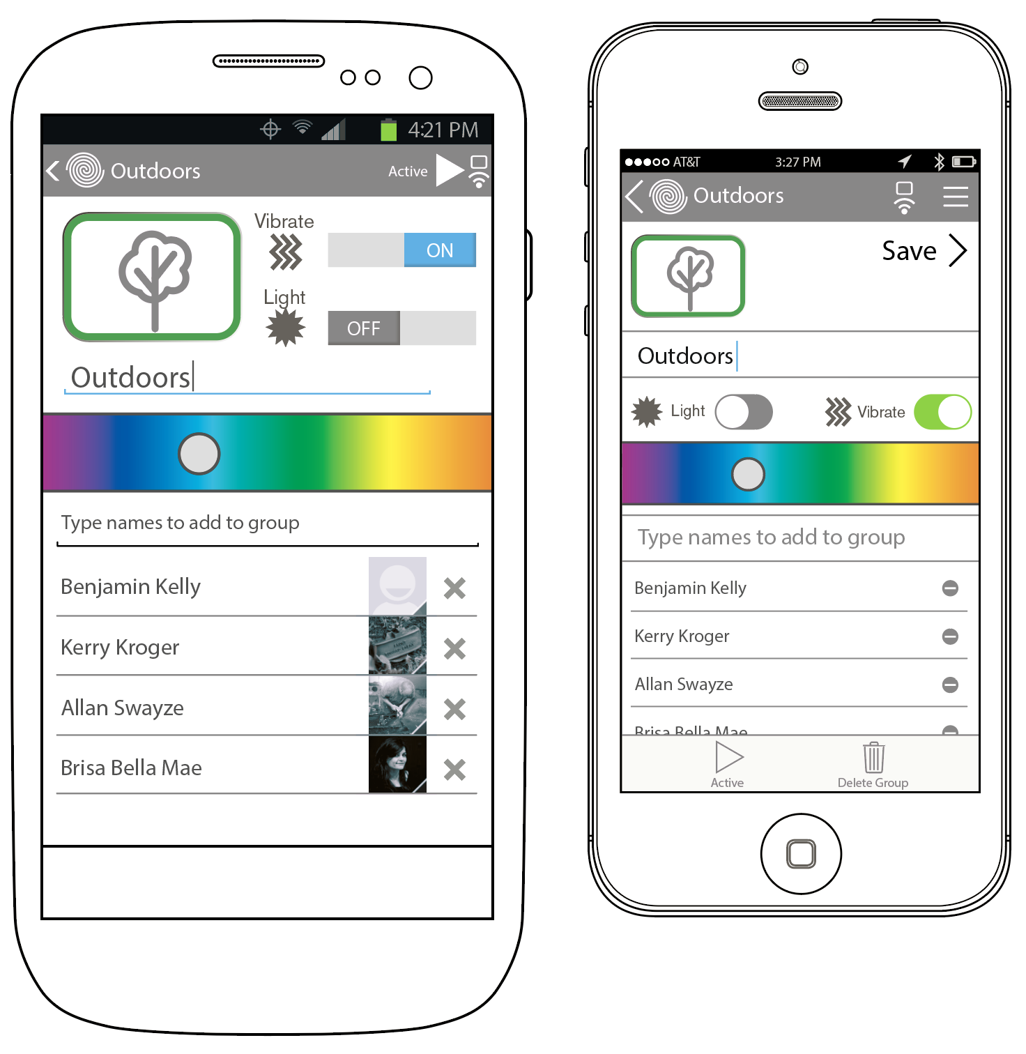
Mobile Design System (Sprint)
2010
Sprint, even more so than many mobile operators, demands that phones on their network all look and work much the same way. Much of this is common sense, like making sure the SMS messenger actually complies with their network, but a lot is style, terminology, presentation, and interaction.
Long before design systems became trendy, Sprint had one to achieve this which they distributed to the phone OEMs. Over time it had grown and was out of date, full of inconsistencies and inaccuracies, and simply confusing. Sprint contracted me and my agency as outsiders with skill in mobile to create a new set of updated and easy to use documents.
We analyzed the (literally!) 10,000 requirements, removed all the conflicts, and working with several different departments at Sprint, clarified and updated the design and technical specifications.
Also critically, we performed usability research. We visited four different mobile phone makers, discussed how they used the documents, and watched them work. This understanding of how design specifications are used informed not just that design system documentation, but how to create design specifications in general.
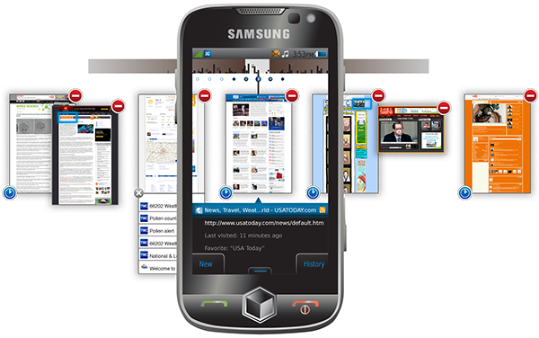
Mobile Web Browsers
2007 - 2011
Over the years I have worked on — depending how you count — from three to seven different browsers for mobile phones: Bitstream Bolt and Thunderhawk, DVC Labs Skyfire, and Samsung Dolfin for Bada which became their general Android browser.
Here are a handful of design documents for the Bolt/Thunderhawk and Croozer/Skyfire designs:


For several of these I engaged repeatedly, updating the browser design and features, and changing the design from scroll-and-select interfaces on featurephones, to work on touchscreen smartphones as those gained market dominance.

For the Samsung browser, the design I created with my team, among other things, had as a requirement tabbed browsing, but we removed the whole concept of actual visible tabs. They are too small and confusing for mobile handset scale devices at the scale browsing tabs might be opened. Since an interaction is already needed to reveal tab controls on every other mobile browser's window switching tool, we decided to use a totally different system once that is activated.
A set of indicators and controls were attached to each "tab" (like the delete) visible instead of being under menus or requiring gestures only.


The Samsung overlay for the default Android browser until at least 2018 used this same format for tab/window control, and other features and UI widgets I designed. Many other OS makers and third party browsers adopted broadly the same method, and with variations it is still the norm for mobile multi-windowing experiences, within browsers or not.
Future Thinking White Papers (Qualcomm)
2009
As some of the earliest and most innovative mobile-specific designers at the time, Qualcomm contracted with us to create a series of white papers on topics they provided, including 3D, augmented reality, haptics, NFC, and voice (for command and transcription).
The goal of these was to provide them a base of knowledge for the state of the industry, available and future technologies, usability concerns and concepts, and value to end users. Qualcomm fed these into the product roadmaps, and a number of the things we proposed ended up happening, even if years later.
Data-Centric Websites (Bank Midwest, IGLTA, etc.)
2012
I did a few projects for a local agency that had a fairly marketing bent to their design, and couldn’t really handle complex webapps, which some clients demanded.
I created design languages, and simple systems for the projects, all high level so their visual designers could fill in details. I created task flow/IA diagrams integrated with navigation and wayfinding, and drew wireframes of many of the key components and templates.
The biggest clients were a regional bank, and an LGBT travel service, as shown here. Both required flexible and data-driven designs frameworks instead of fixed web pages.
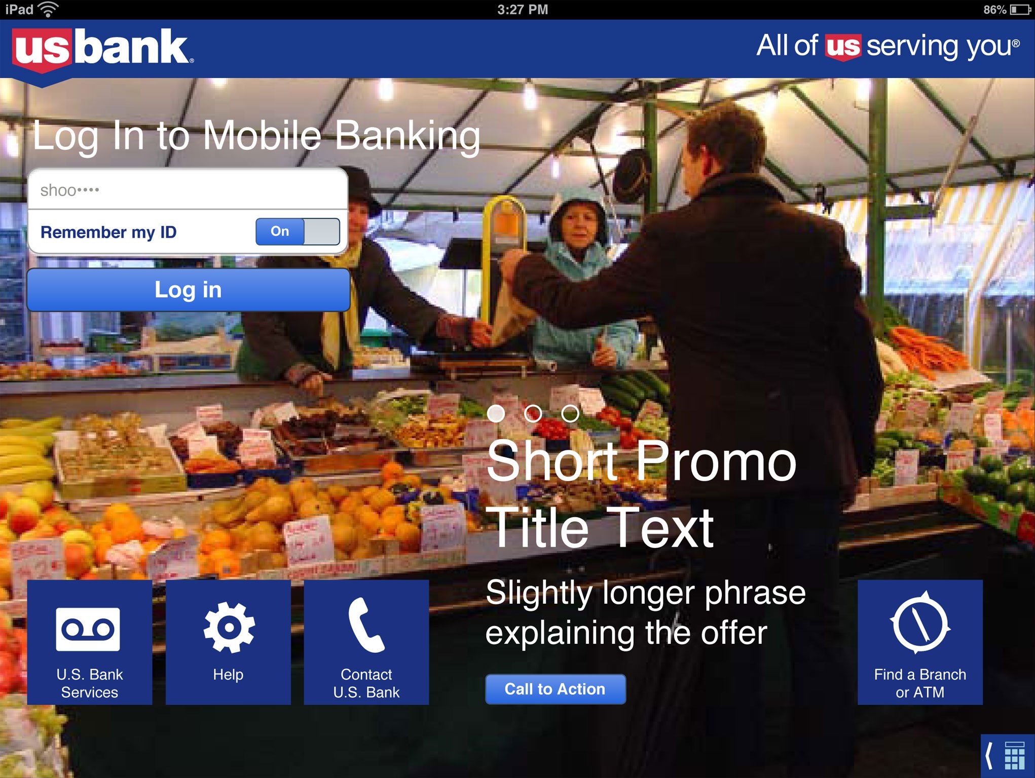
Mobile and SMS Consumer Banking (US Bank)
2012
This was a highly-constrained environment, and not all of it was the regulatory and legal requirements of being a bank. Banks are highly oriented towards their “serial processing” (mainframe) style of data management, and vendor did all the development on a home-grown hybrid platform with few capabilities and minimal ability to use native OS features. Much of the process had to use existing components, with clunky pagination or needless popups. And lots of typing.

I was occasionally able to push things a little and created new widgets. Even so there were many constrains on amounts (steps, upper and lower limits) so building new widgets and defining the right one to avoid error messages was challenging, but improved the interaction tremendously.

These projects were implemented on every likely platform. All the smartphones, the mobile Web, and even a version for especially low-end mobile browsers. Most features even worked in SMS response, so any mobile device, even with poor connectivity, can get at least basic functionality.

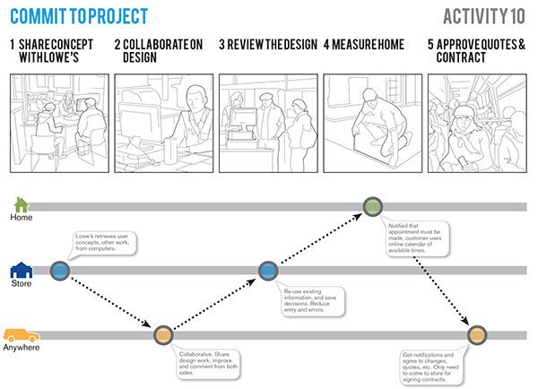
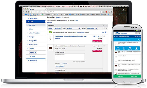
Personalized Home Improvement Experience (My Lowe’s)
2011
Lowe's Home Improvement — the second largest home improvement store in the US — had been kicking around the idea of a personalized, omni-channel "My Lowe's" experience for some five years, and had even commissioned quite extensive research on user's buying behaviors, and digital needs.
I was brought in as someone not involved in day-to-day operations, so could be dedicated to the effort. I evaluated, and led group exercises to develop vision statements, design objectives and define actionable business goals.


Once the basic designs were settled, and the project was approved, a large project team was assembled. I continued as an IA/IxD for one portion of the effort, while continuing to help coordinate and consult on the entire My Lowe's effort.

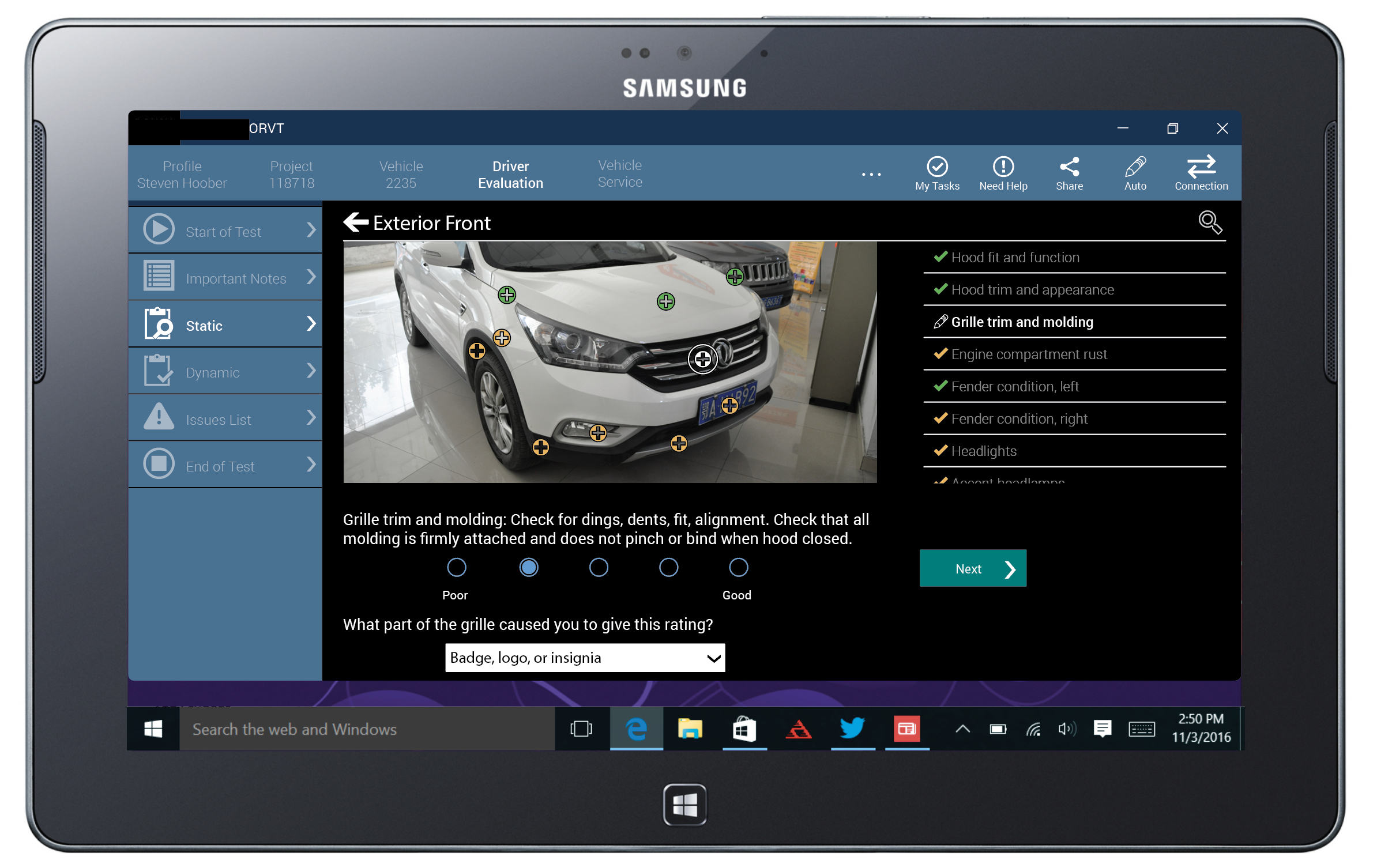
Test Driver Portal
2016
I performed an ethnographic study of the process of a company that tests cars and trucks for automakers to report on faults, and give quality ratings. From the office, to riding with the test drivers, to seeing how the data is handled once gathered.
The project was part of an effort to get away from paper, as the process involved massive, massive amounts of paper. Which had many issues, not least of quality and safety for the drivers.
The research results were provided, along with a set of design principles, and example designs the client could use to build their in-house custom product to schedule, create, gather, and analyze tests.
Corporate Digital Design System
2017 – 2019
Building on work I actually did assist with as long ago as 2012, and working with the corporate UX and corporate brand managers, I and my team revised all the design guidelines into a single set of Digital Design Standards that could be applied across the global enterprise, for dozens of apps and innumerable websites.
While standards focus on mobile apps and responsive web, the basics are generalized across all digital properties and have been applied to other products including Windows PC applications, information radiators, IOT devices, and hardware control panels used on the equipment the company sells.
Smart Connected Wearable (Trellie)
2014
Trellie was a moderately successful smart jewelry company, with some very innovative, low-bandwidth (blink and blink-coding vs complex screen) devices, but when Apple entered the market all investors and tech columnists decided that was the only way, and they sorta disappeared.
For the second and third products they were to launch, I consulted on everything from packaging to the actual wearable hardware, and did the entire design as shown on the mobile app to set up how the device behaved.
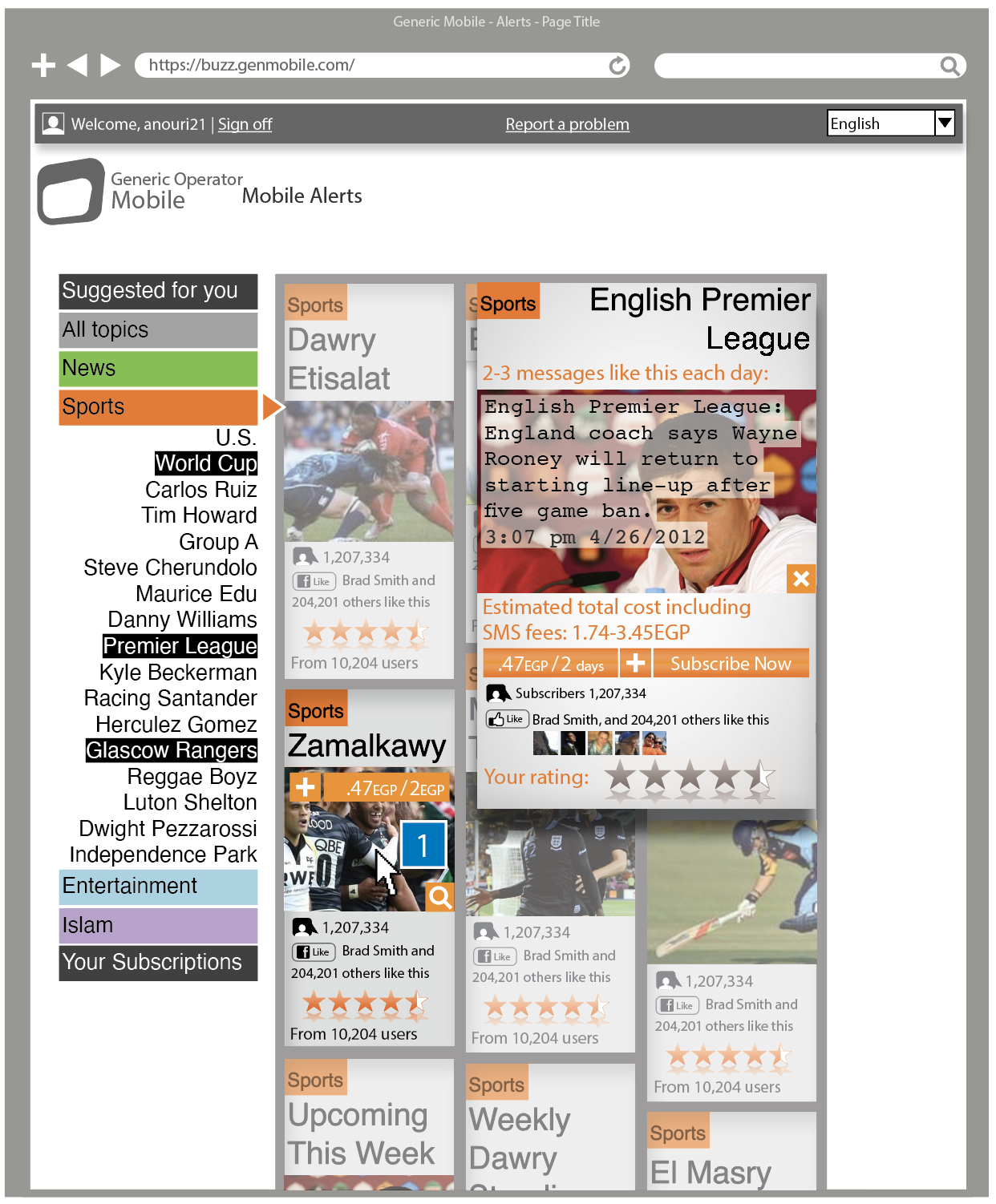
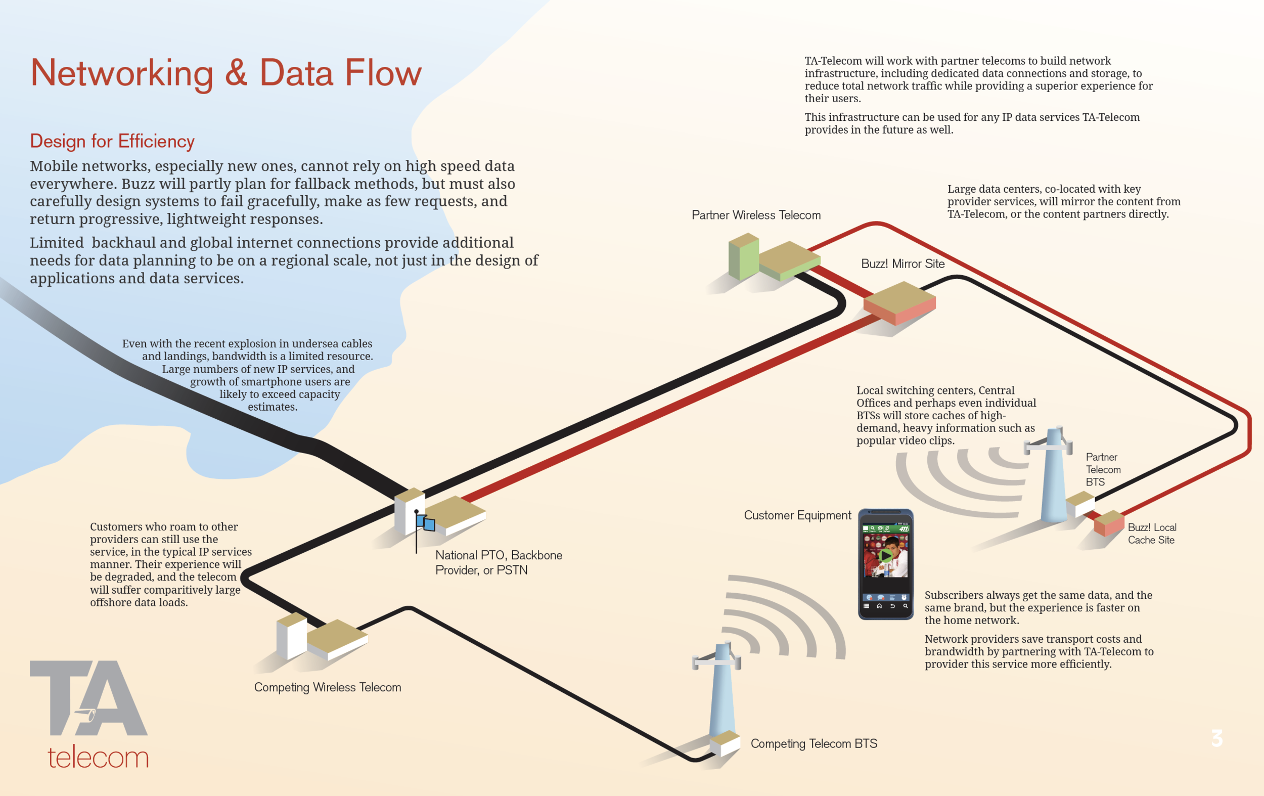
Mobile Operator Services (TA-Telecom)
2012 - 2017
If you didn’t know, and almost no one does, mobile operators don’t really own or develop any technology. From base stations to billing systems, they just buy hardware and lease services, and bolt it together, mostly invisibly to end users.
TA-Telecom is a creator and provider of many of these services, mostly around messaging, online sales, news, promotions, and data, across MENA, into southern and southeast Europe.
I worked with them for several years to create concepts, and detailed designs, and to help inject usability best practices to help them better understand the market. All design work had to be from featurephones to smartphones, much had to also have an SMS capability due to network availability, and a few also had web portal components. Products were consumer facing, but usually involved the operator management side as well.
I specified and analyzed test data, including in-home visits to understand how women in the region consumed and used news. This was of course something I pointedly did not perform myself, for cultural reasons. I helped coordinate with the contracted women researchers instead.
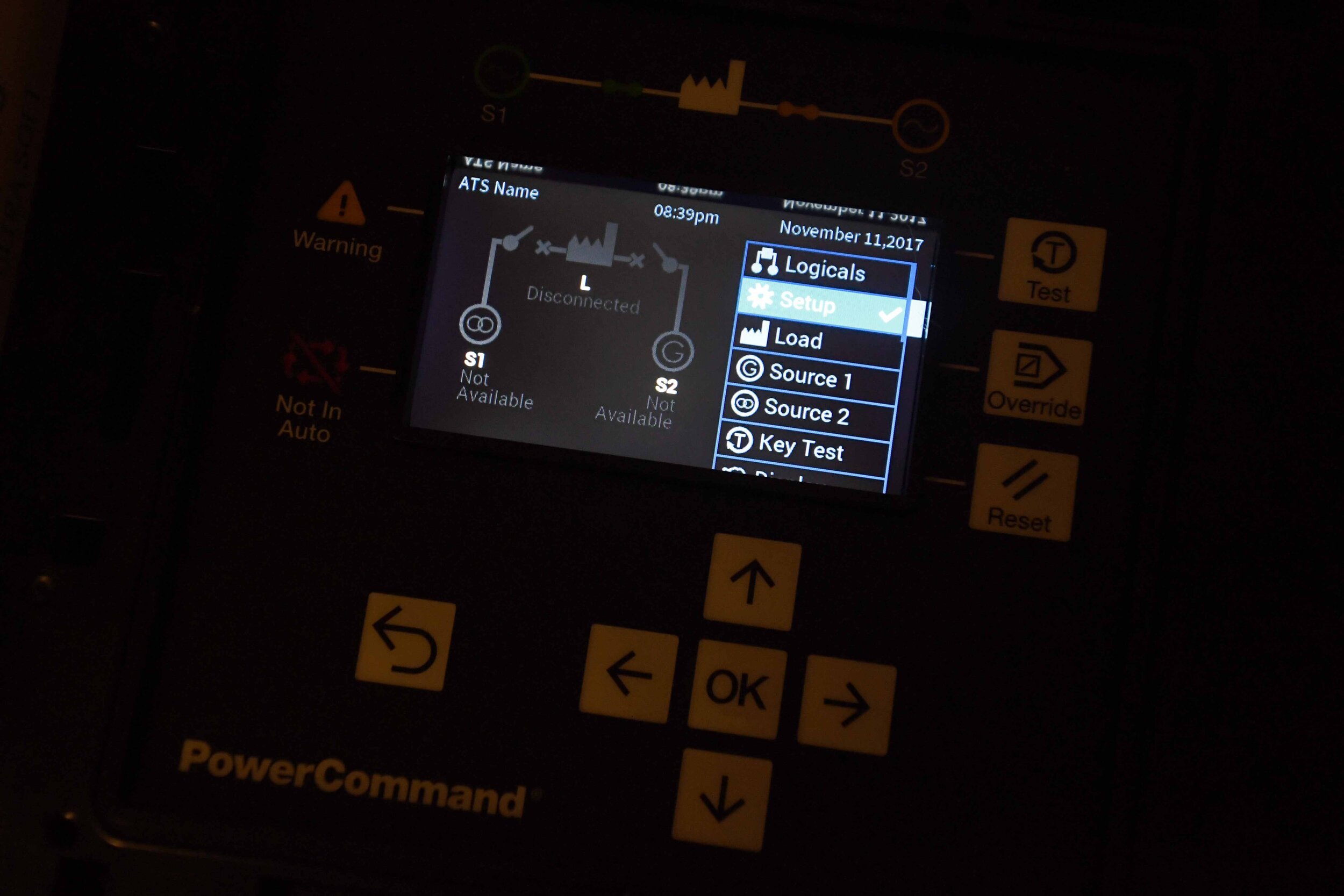
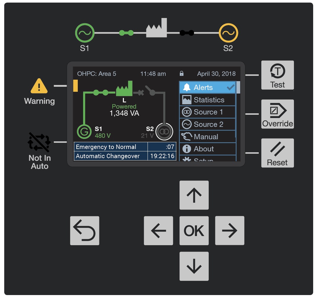
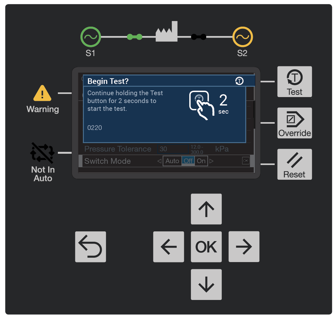
Electrical System Control Panels
2015 – 2018
I have revised the design of a number of control panels for transfer switches, generators, and related electrical equipment, and designed several from the ground up, working with engineering teams to select software, hardware, molding, and printing processes. I designed not just the on-screen experiences and UI, but the printed overlay, LED light placements, key repeat behaviors, and much more.
Most of those I have worked on for this project are pushbutton controls. They aren’t actually cheaper than touch anymore, but they are much more rugged and easy to use in the full range of environments; touchscreens do not work well in very cold or wet conditions, or when the users have gloves on. Related projects I worked on — performing usability testing, creating design concepts, and performing detailed component design — involved machine controls in mobile apps, and the web.
Most of the work is related to bringing the controls into the modern era, with color screens and otherwise modern design sensibilities. For certain overseas markets, lower cost versions were also made with high contrast black and white screens. The design system put in place is flexible enough to be adapted even to this low-end hardware.
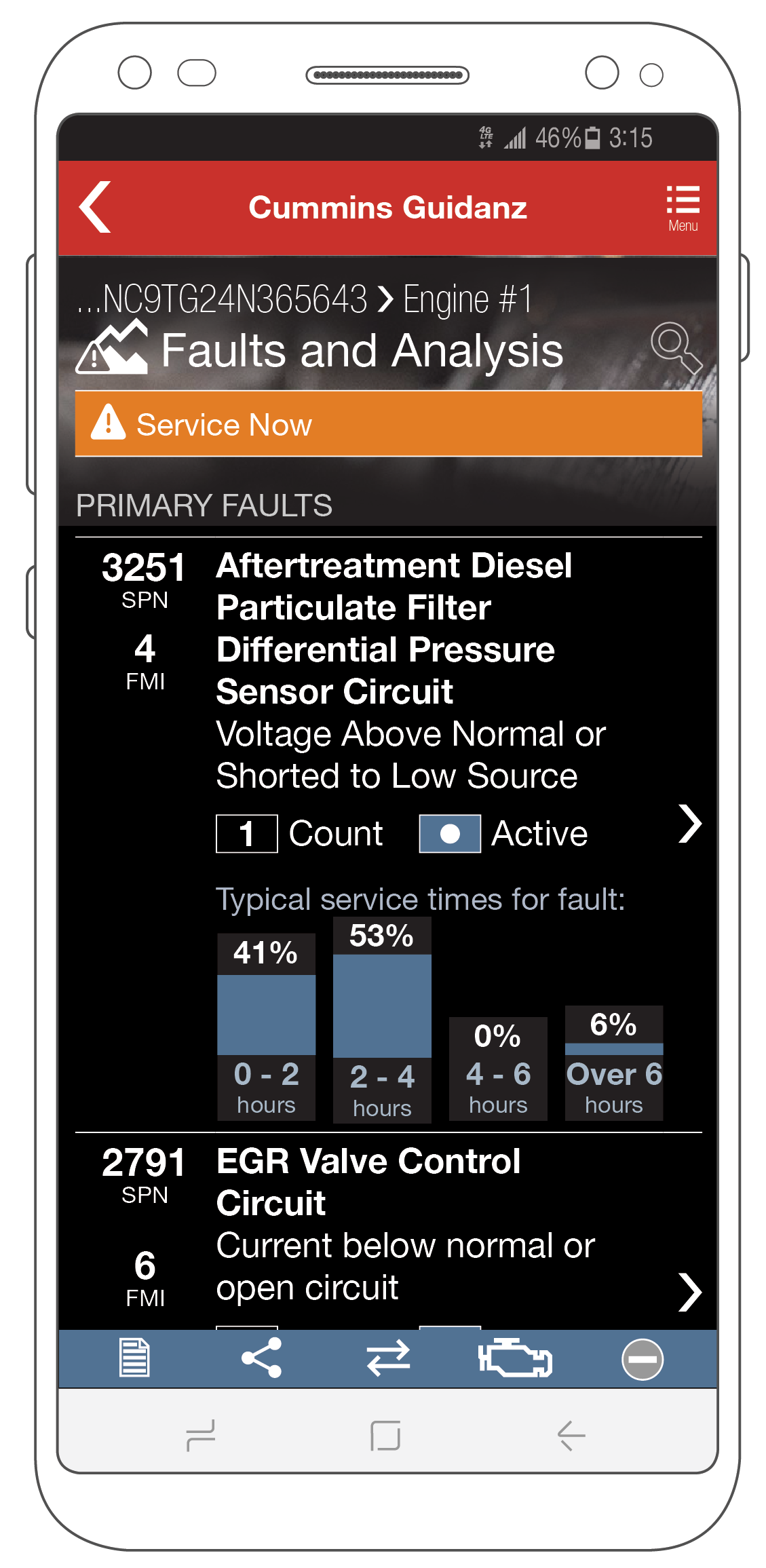
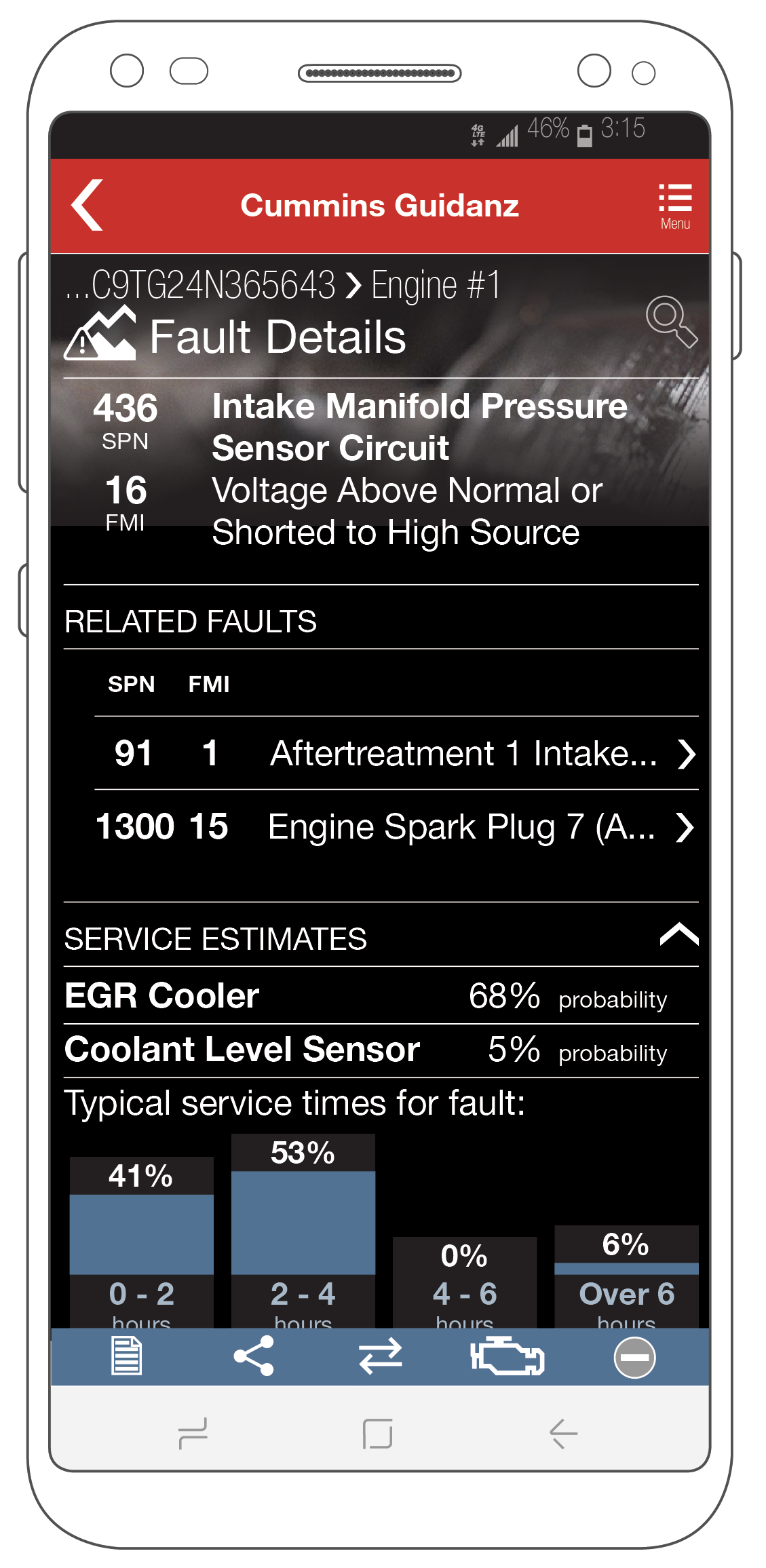
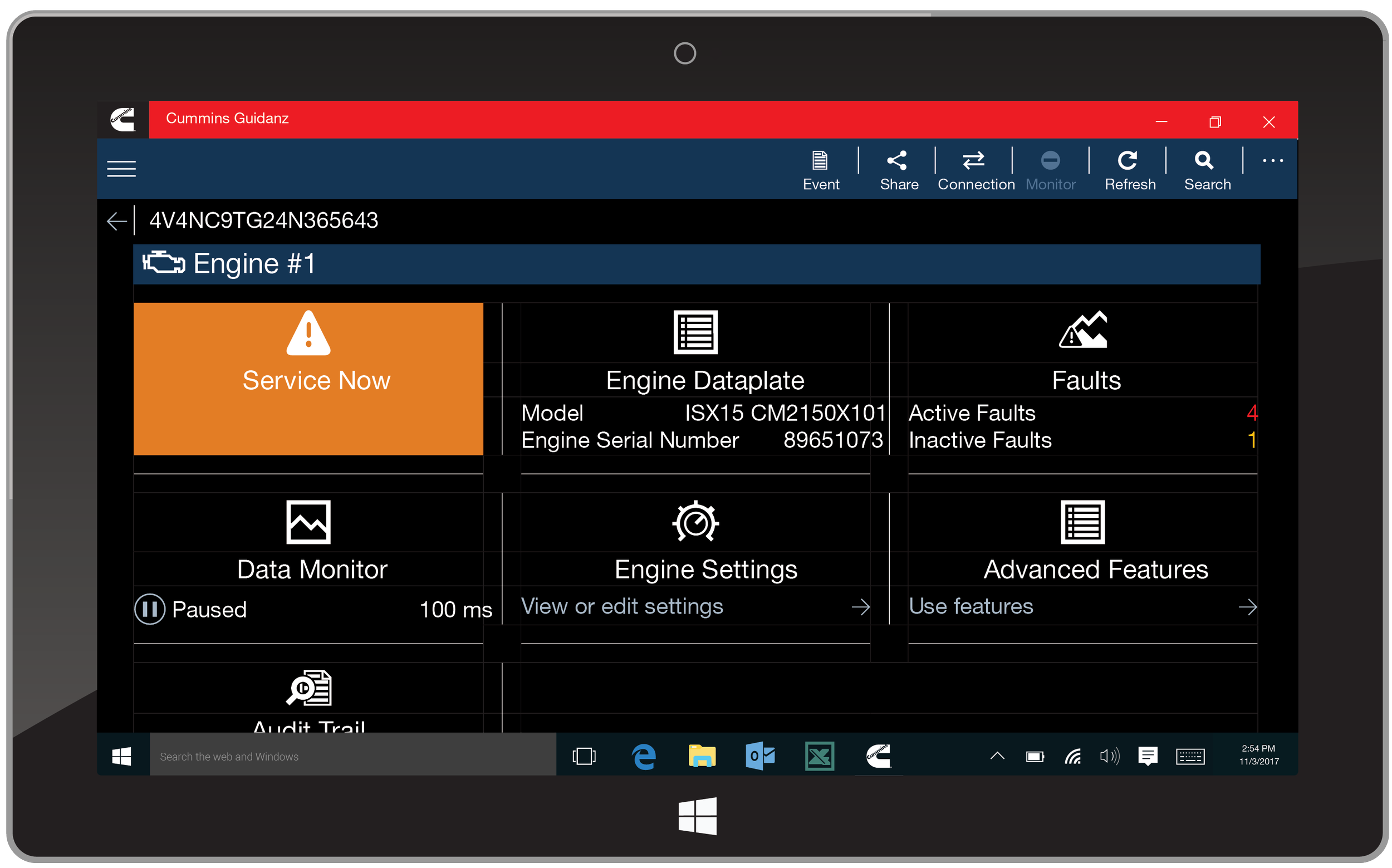
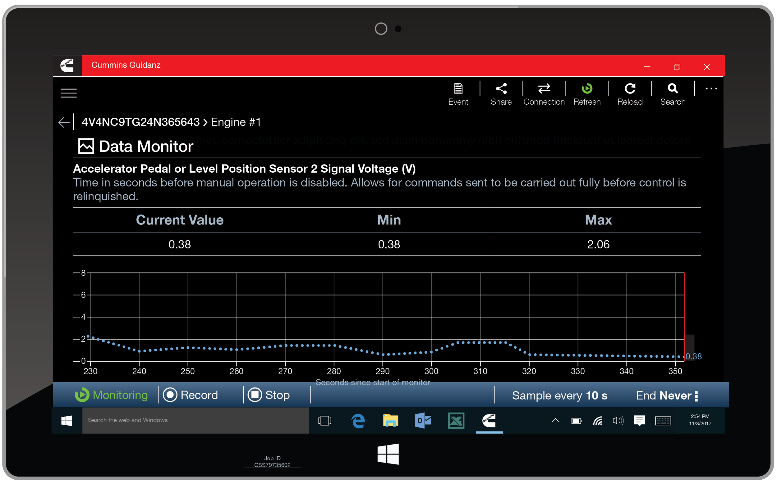
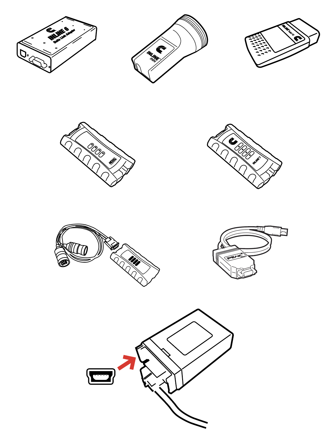
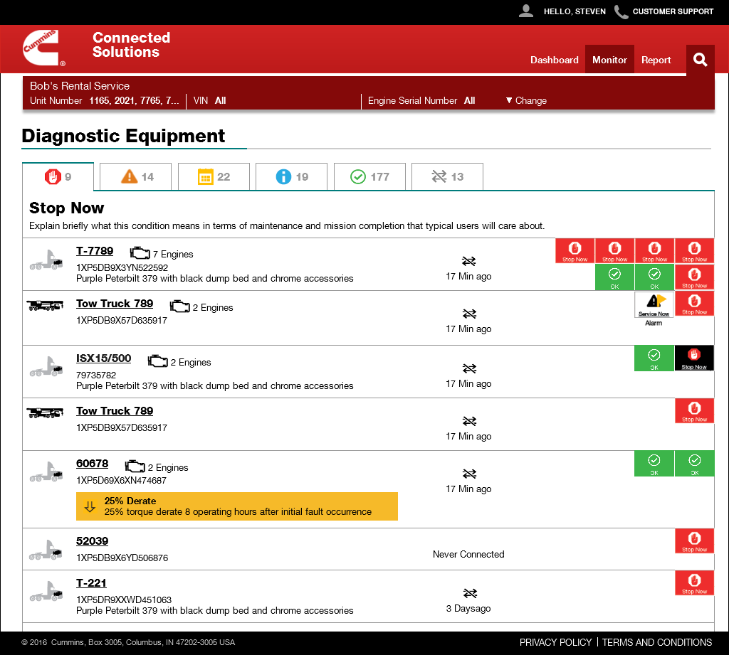
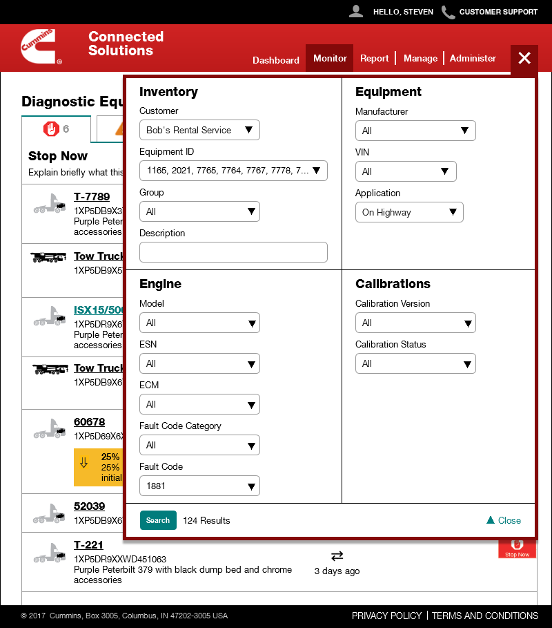
Engine Monitoring and Service Tools (Cummins)
2012 - 2022
For nearly a decade I worked with the largest independent maker of diesel engines, as well as associated engine equipment, generators and power distribution equipment, and electrified trucks and busses. I have worked on dozens of projects to support essentially every division, mostly designing websites, mobile and tablet apps, and desktop applications.
Many are essentially turning thick old paper books, the same distributed on CDs, or call center processes, into digital and self-service experiences. A service center locator website, a consumable cross-reference app, an eStore to purchase products and more. But a few have been turned into entire lines of digital business to support the “core” hardware sales. Some even generate revenue, so become business units, and are operationalized, with regular revisions and updates.
Two of these, which overlap a lot, are a telematics tool — responsive web and mobile app — to track the location and operating condition of trucks and other equipment like construction vehicles, and a mobile app — with associated website — for technicians to service the equipment in shops and in the field.
While some were simple revisions, and improvemented, I created the baseline design and architecture for most of these products, including a complete redesign of the style guide/design system for the telematics product after the first two releases due to new scope of work. Over the years I have worked regularly, often multiple times a week, on designing new features as many of these products expanded their technical capabilities, and to help internal teams adjust to these radical changes and the shifting digital landscape.
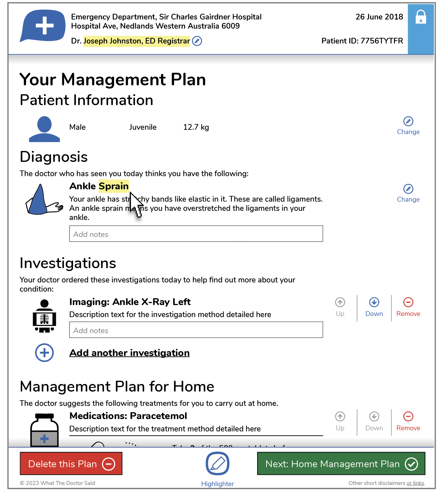
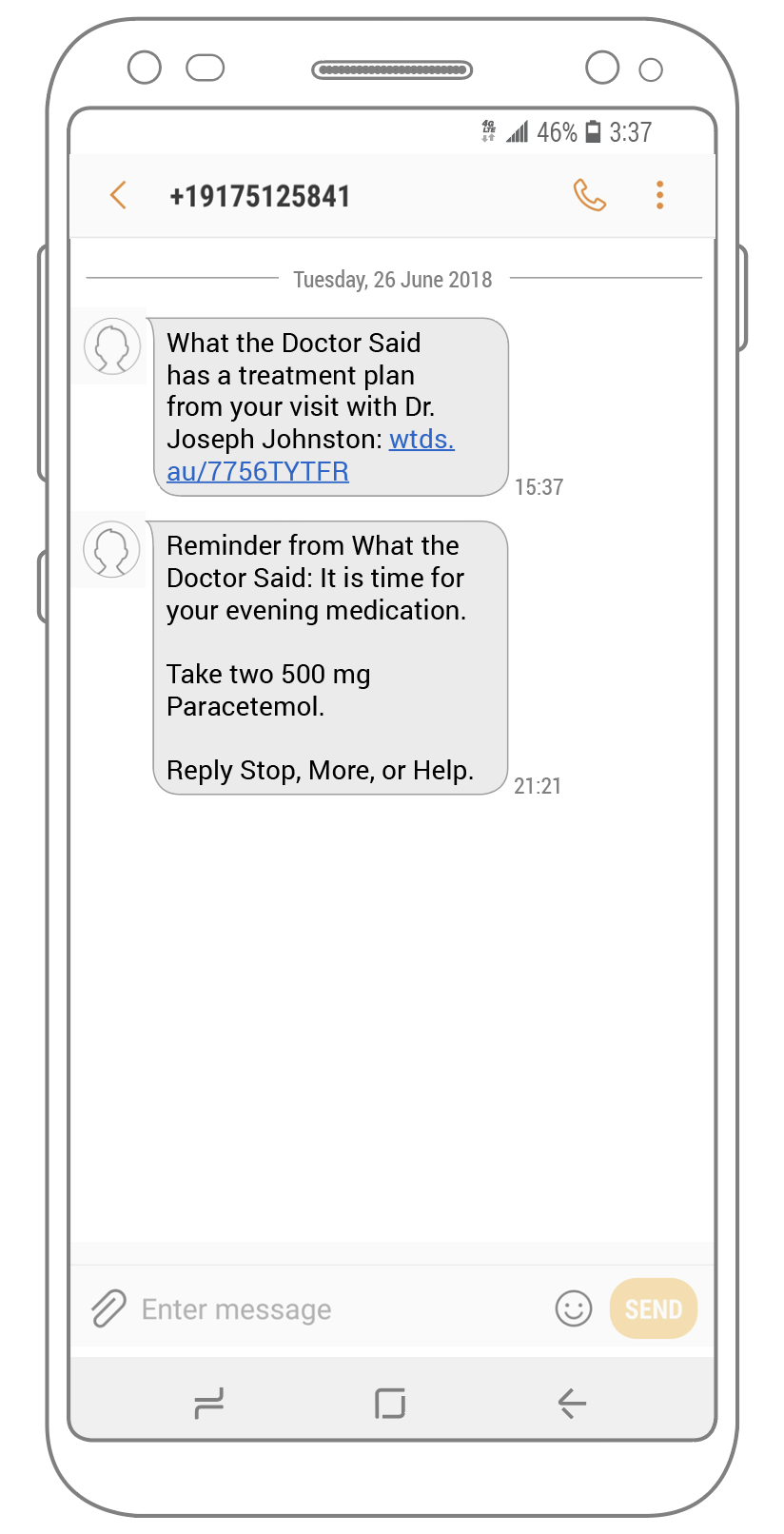
Doctor Visit Take Home Instructions (What the Doctor Said)
2018 - 2020
Patients leaving emergency rooms, urgent care clinics, and doctors offices very often have to do additional care at home. The current state of the art is a mass of printouts and brochures, often with hand-written instructions.
This takes time to gather, and is poorly followed so there are poor outcomes; patients come back for the same issue far too much.
This doctor-led project — supported by the regional Australian government — aims to provide a single, simple source for generating these instructions, and multiple methods to consume it. This is designed to help assure that doctors fill in the instructions, and that patients or caregivers always have access to them.
I and my team designed a desktop website for doctors to generate instructions, and print, web, and SMS response tools for patients to consume them. Feedback from hospitals and usability studies led to several revisions and improvements already, and was rapidly revised to help hospitals that used it cope with the influx of COVID-19 patients.
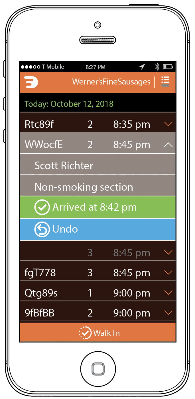
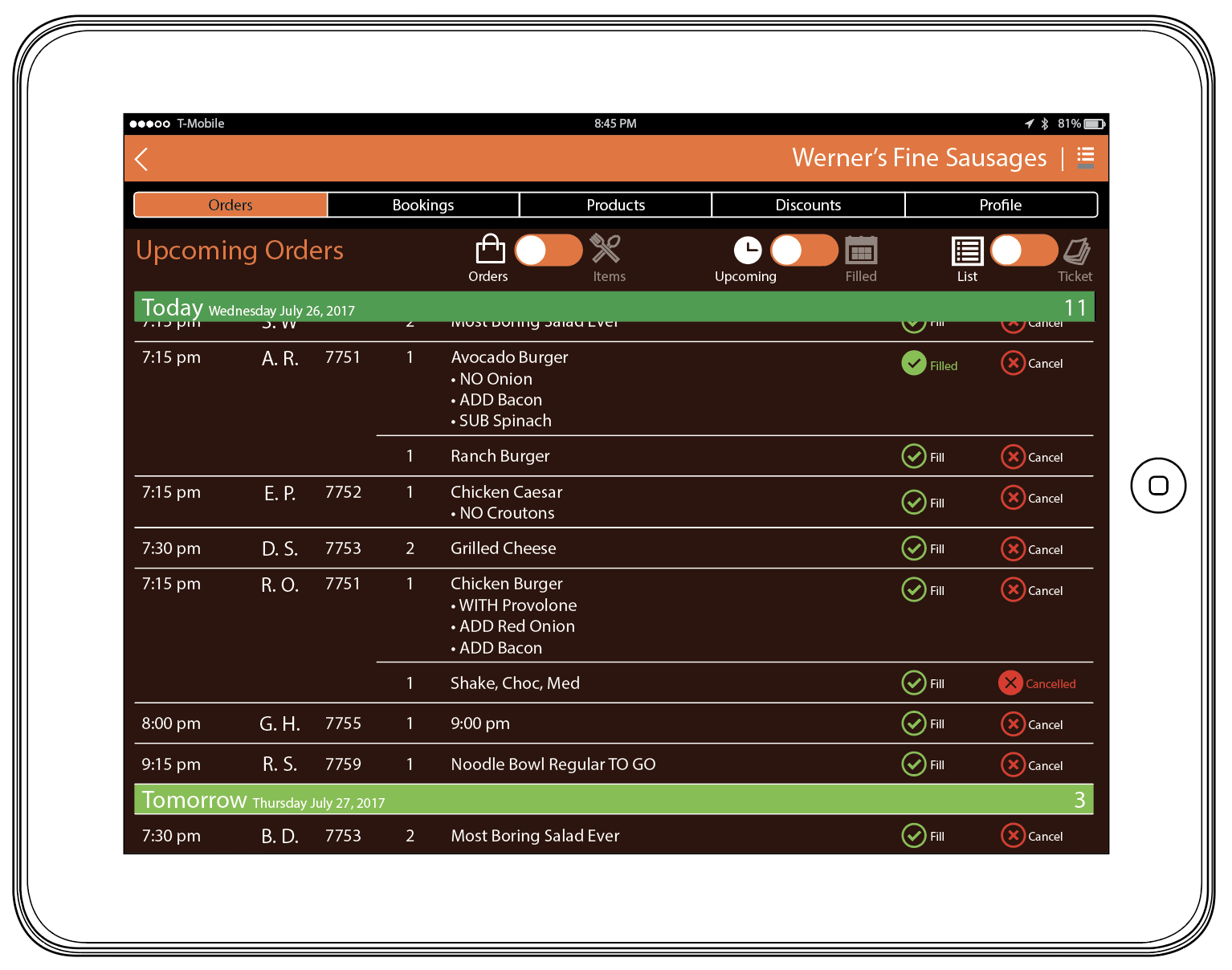
Restaurant Reservation System
2018 - 2021
Disruption in the restaurant industry has largely been not for good. All the major players are a loss leader for the restaurants involved, taking revenue from them. And, they are generally unprofitable as well, driving evil practices like the creation of online-order-only stores that emulate established locals.
This startup seeks to change that relationship in fundamental ways, by empowering the restaurants to do what they already do, just better by being online, being discoverable, and by allowing them to compete with the other services.
I have worked on all aspects of the product, from sales and marketing websites, to the customer and restaurant app interfaces on mobile phones and tablets respectively. Some of my work is deliberately high level to allow broader thinking by the team, or better collaboration with marketing, content, and visual design/brand teams.
Strategy & Executive Presentations
As someone with broad experience I often serve as a bridge between design, product, and management or executive leadership. Further, my desire to clarify intent often means I make documents that explain or interpret corporate intent.
Between these turning into formal presentations and my strategic thinking being engaged directly, I have made hundreds of presentation decks and other documents, and often end up helping tweak or even change the direction of executive guidance once real-world concerns such as technology, usability and research, or regulatory concerns are brought up.
I also often create graphics and illustrations for these, and have coordinated creating animations, videos and voiceovers, and other supporting materials.
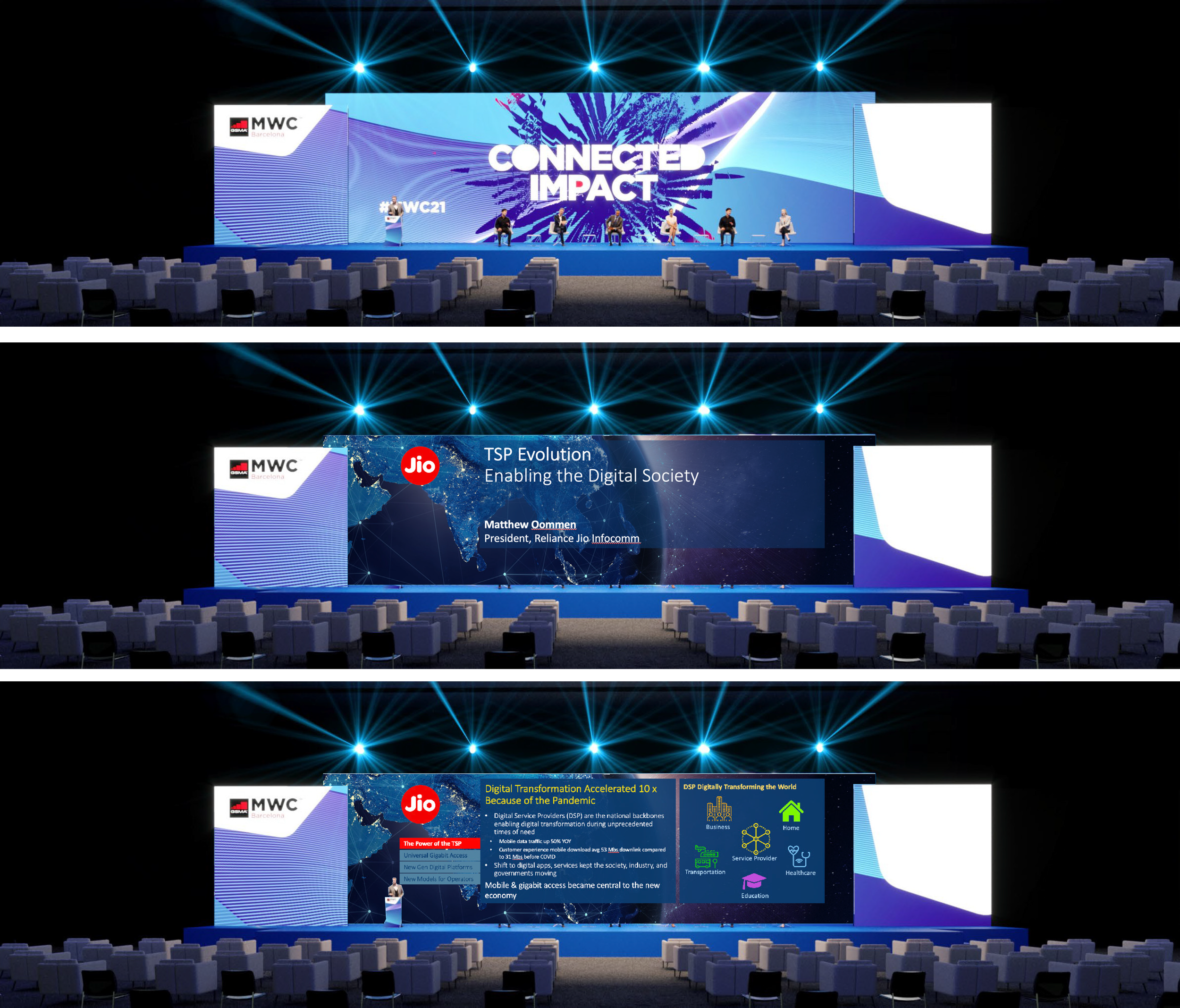
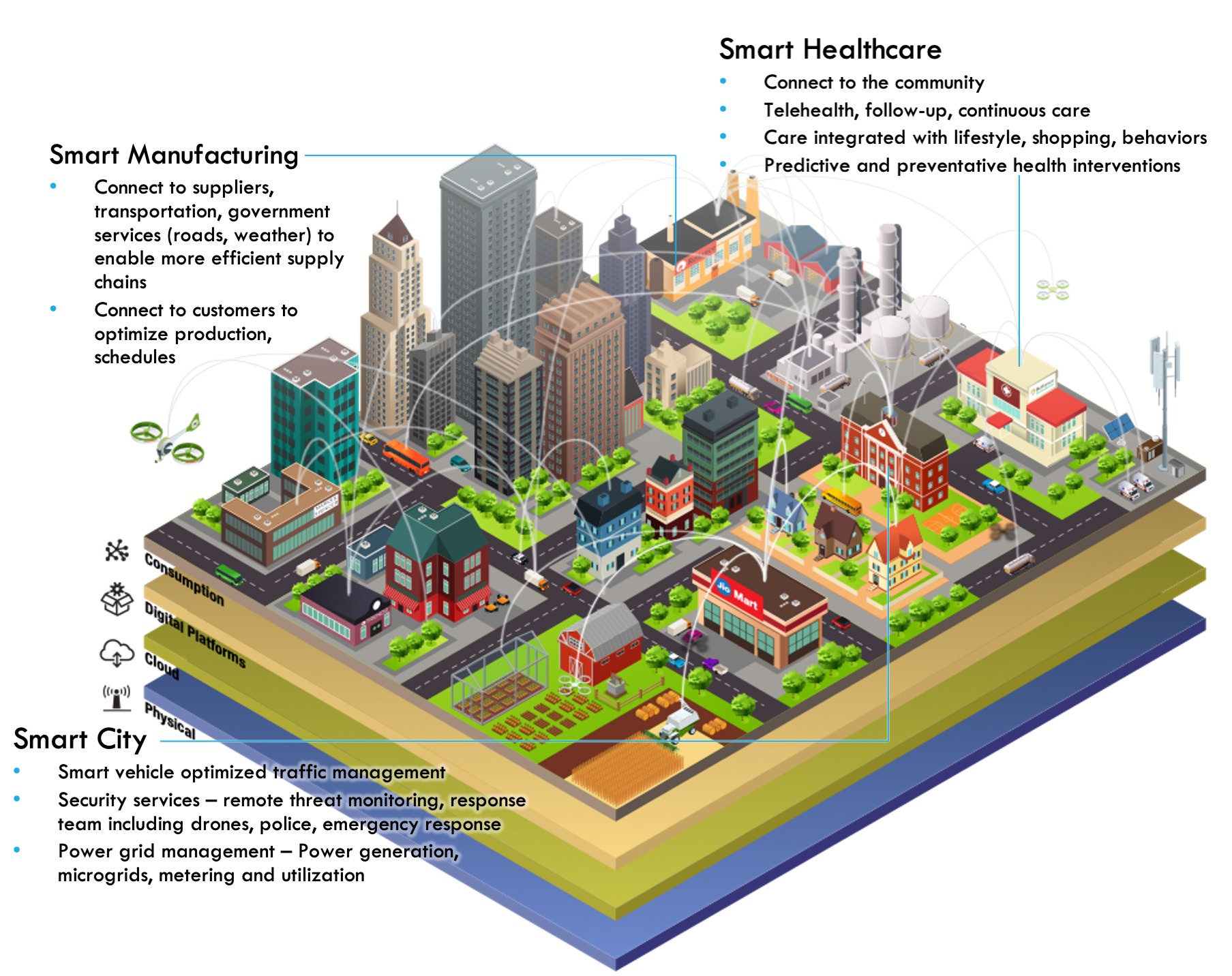
Many of these are of course so strategic or internal they cannot be shared, but these snippets are from one I did for Mathew Oommen, President of Reliance Jio Infocomm, presented as a keynote at MWC 2021. Above is part of the presentation planning and explainer of why the slides are so oddly wide to the executive team
Below is part of a slide, an illustration (admittedly put together from components purchased from elsewhere) I created to illustrate one of the concepts, and with all captions I wrote to explain the overall vision in a more universally-consumable manner.
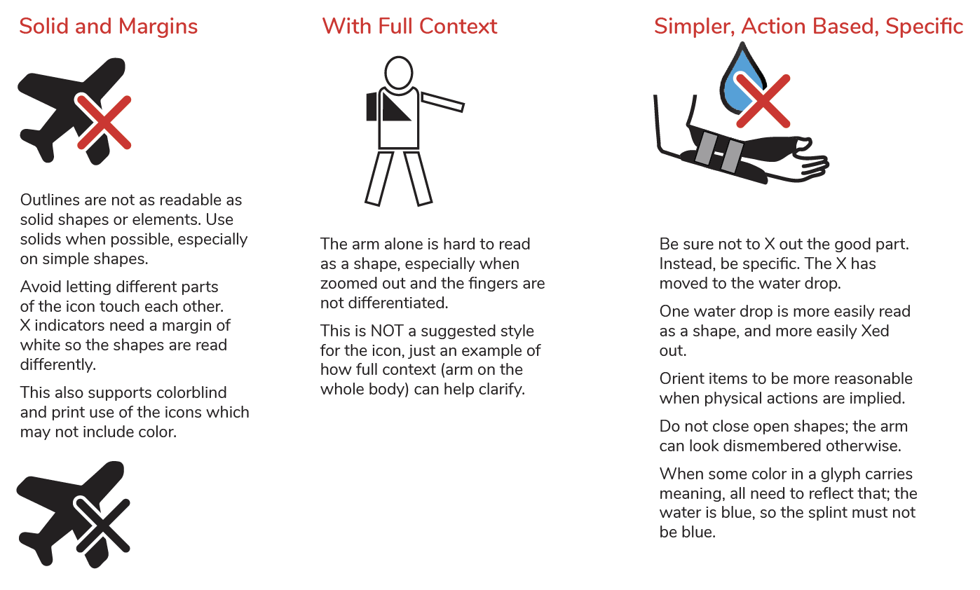
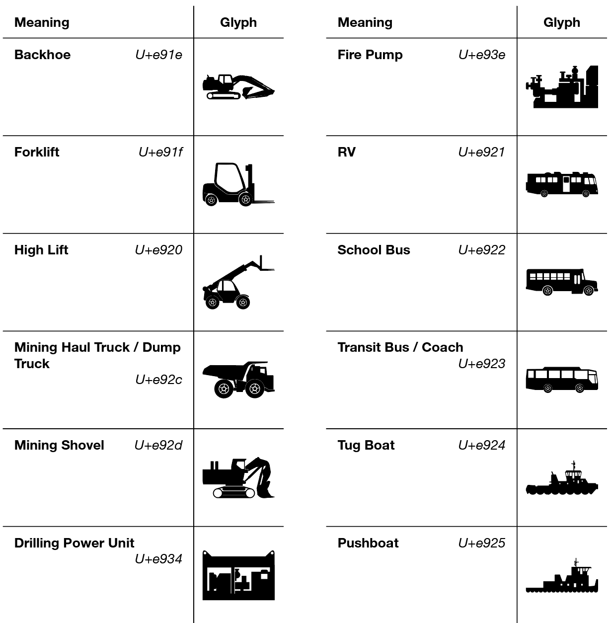
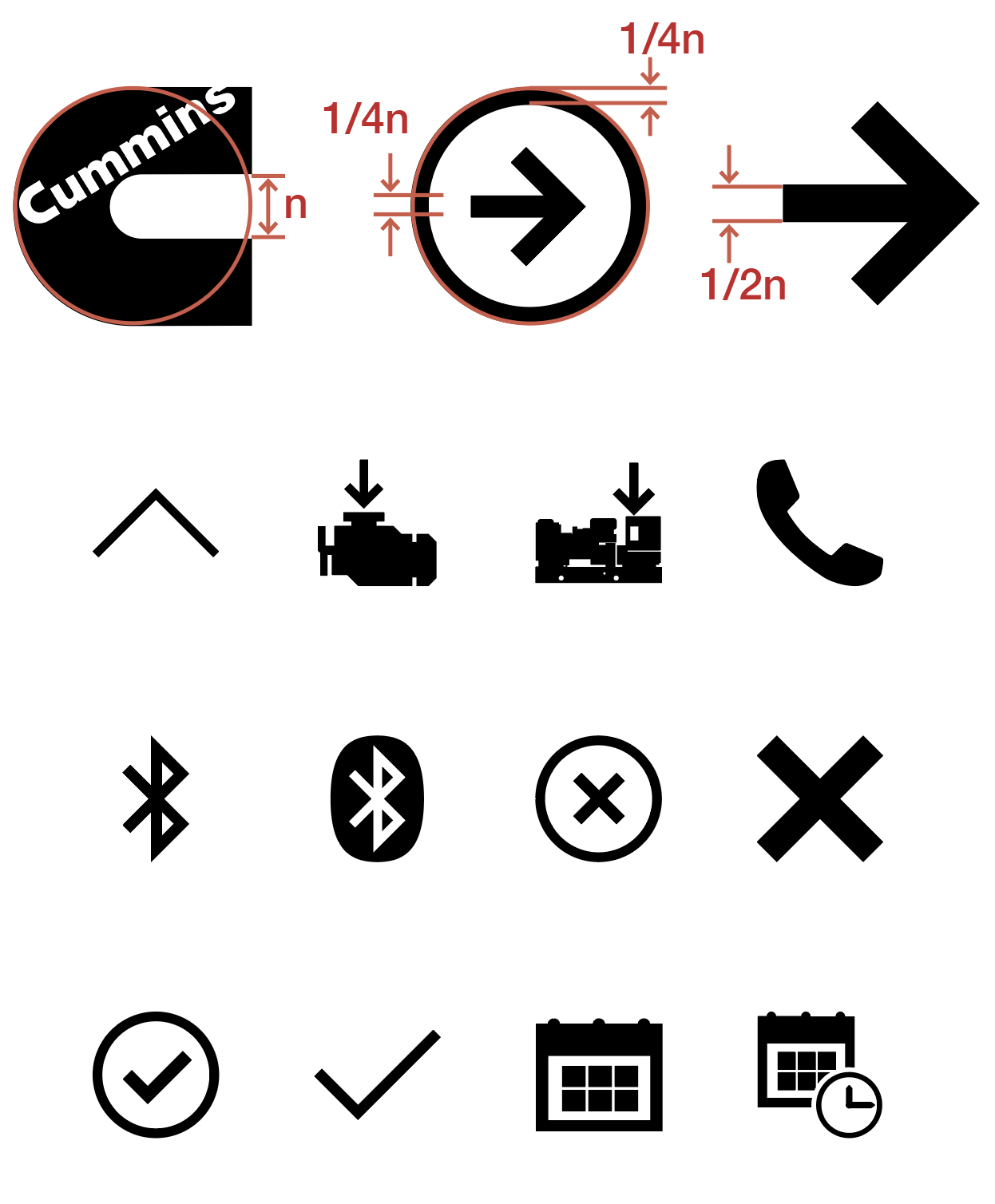
Icon Libraries
A key part of consistency and usability, hand in hand with design systems, is providing not just guidelines for design of graphic elements but an actual controlled library of icons, that can then be used across the enterprise and on all platforms, from websites to control panels.
I have designed almost a dozen complete icon libraries, and assisted with guidelines or individual icons for dozens more. While I also have a graphic design background and art degree, I mostly do this because no one else will, as a way to bring together disparate styles to a single system of design.
This also sometimes includes similarly-consistent illustrations of products, or how-to instructions that are a bit more detailed than icons but serve a similar purpose, and are used for icon-like representations of products in lists or stylistically inline representations of tasks for the user to perform.
Close coordination with dev… technology matters, now all vector but that still can be an uphill battle, have to explain why, how, provide multiple methods and varies by platform…
…example of process one…
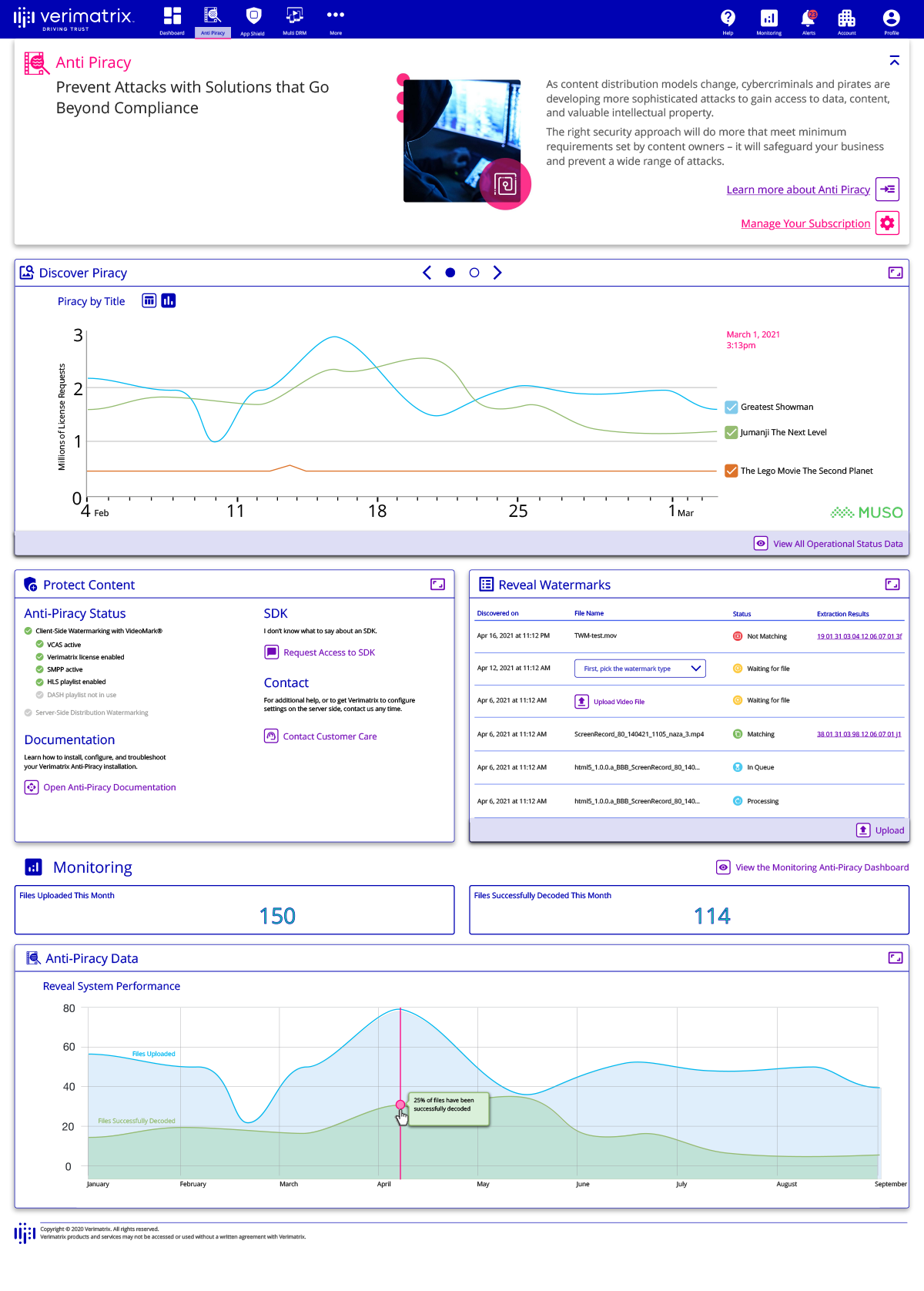
Cybersecurity & DRM Management Portal
2022-24
Verimatrix is a leading provider of video services, with more recent forays into streaming support and anti-piracy tools. This project was a mix of 0-1 and legacy design, since many of the legacy tools were configured by command line interface and actually printed reports on paper. Worse, a series of mergers means many tools are on even more diverse servers and protocols.
A key goal was to make the product easy to use, not just for the existing experts but for many others. This is a secret truth of many products; not only experts use them, but lower level staffers with minimal experience and no training. Verimatrix had found that their experts-only tools were turning off customers, so easy to use was a key selling point, and became an easy card to pull when simplifying forms, and labeling actions better during the design process.
A classic web portal was created, both as a design conceit — using progressive disclosure to make dashboards and encourage exploration by untrained users — and because the services continue in the back end to come from disparate sources but need to act as a single entity to promote the unified Verimatrix brand. The portal took several weeks of discussion, modelling and working with engineering to find a technical and usability solution, and map out a flexible architecture for the site.
I created, with the in-house designer overseeing and drawing some components, a design system, and shared on an enterprise-wide Confluence. This was especially deeply defined and described because there were not enough designers to create all the pages that would follow from them. The component designs and the documentation was made bulletproof enough so developers could create compliant and usable pages.
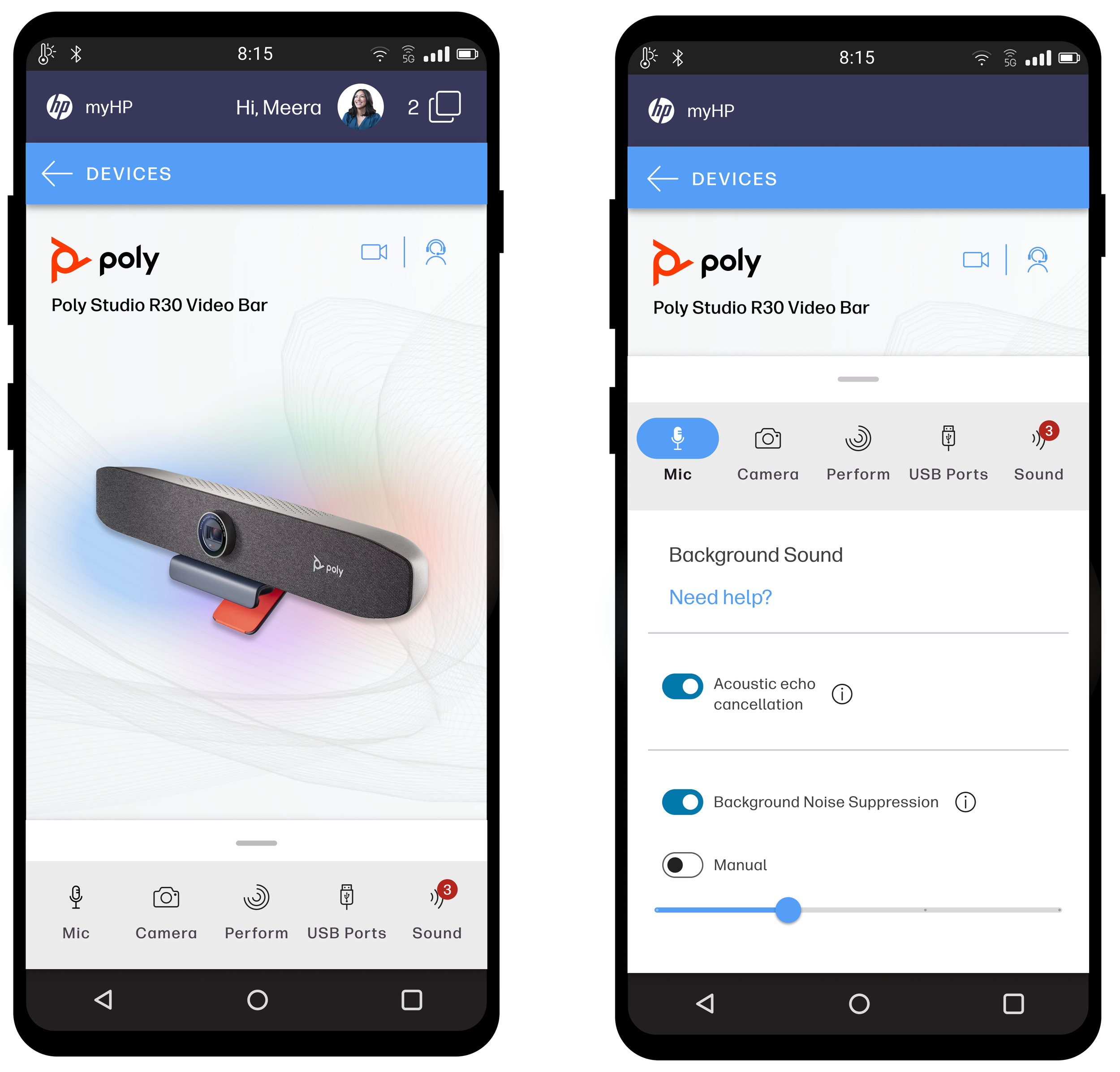
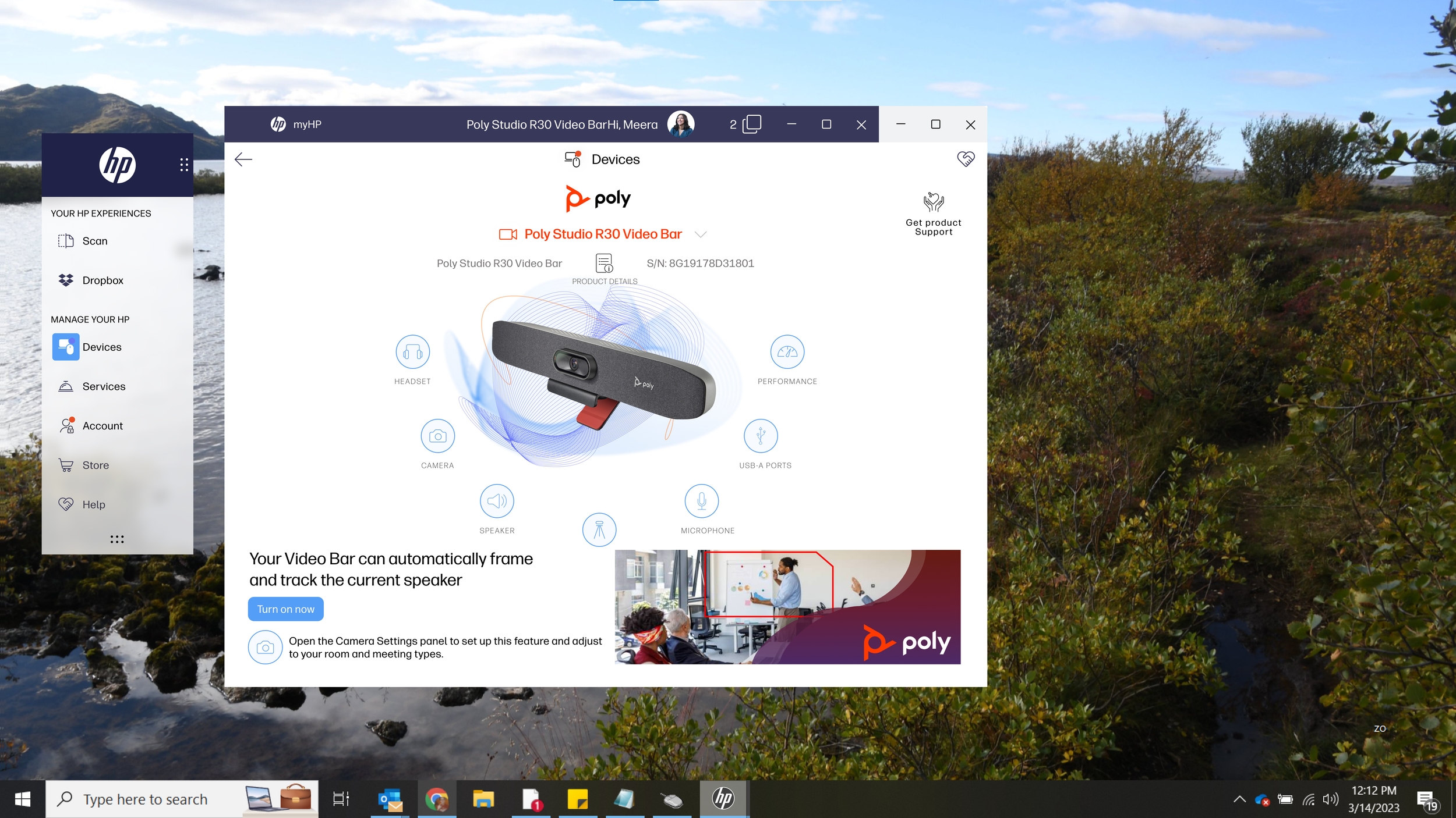
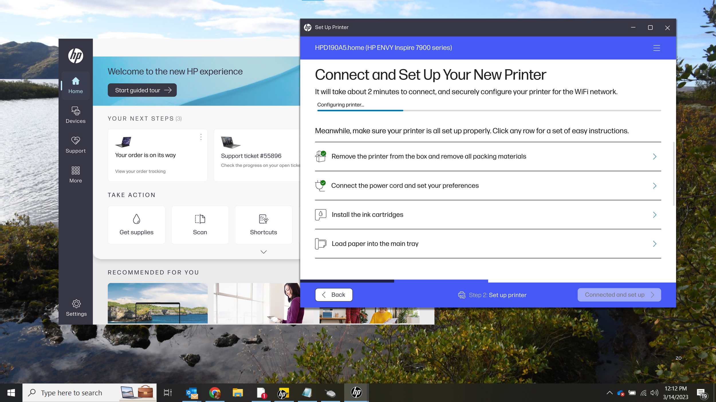
Unified App for Consumer Electronics
2022-24
Among many other small activities, two major efforts occupied most of my time at HP.
The setup and onboarding experience for devices like printers, computers, and accessories is excessively complex and time consuming. Users regularly fail, and must call to resolve issues or simply return the products. Even in testing while researchers watch, setting up a printer can take 30 minutes and many simply give up.
We analyzed dozens of research reports, worked with product teams and investigated technical requirements such as deep dives into the messaging protocols the printers use, and were able to reduce the setup flow from over 60 steps to under a dozen, reducing time to using the device from over 30 minutes, to less than 5.
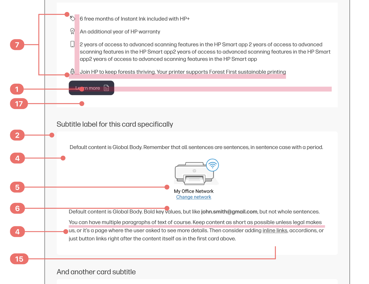
A task map, showing some 60 pages along the top for the current process, and between 8 and 16 along the bottom (depending on the user) for the improved process.
Much of this was design cheats; we didn’t shorten the time it takes to do various tasks like connecting and calibrating, but instead just “folded” the flow, so non-dependent user tasks happen while slow and boring tasks occur in the background. We also moved on from requiring users to do everything a specific way, and allowed more flexibility; now only people who don’t know how to install ink or load paper see instructions for those steps, and they pick how much assistance they need instead of everyone seeing a long video about it.
We also provided wayfinding cues so that users know where they are in the process and how much is left. All in all, usability testing showed near complete understanding and satisfaction with the new process, and began to explore ways to push and otherwise provide shortcuts instead of making the user launch and navigate to further reduce effort and time.
All this setup work overlapped a new unified application that merged many small apps, and created opportunities for all new opportunities to upsell, proactively help customers to avoid care interactions, and provide new customer value.
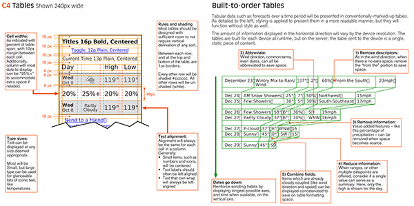
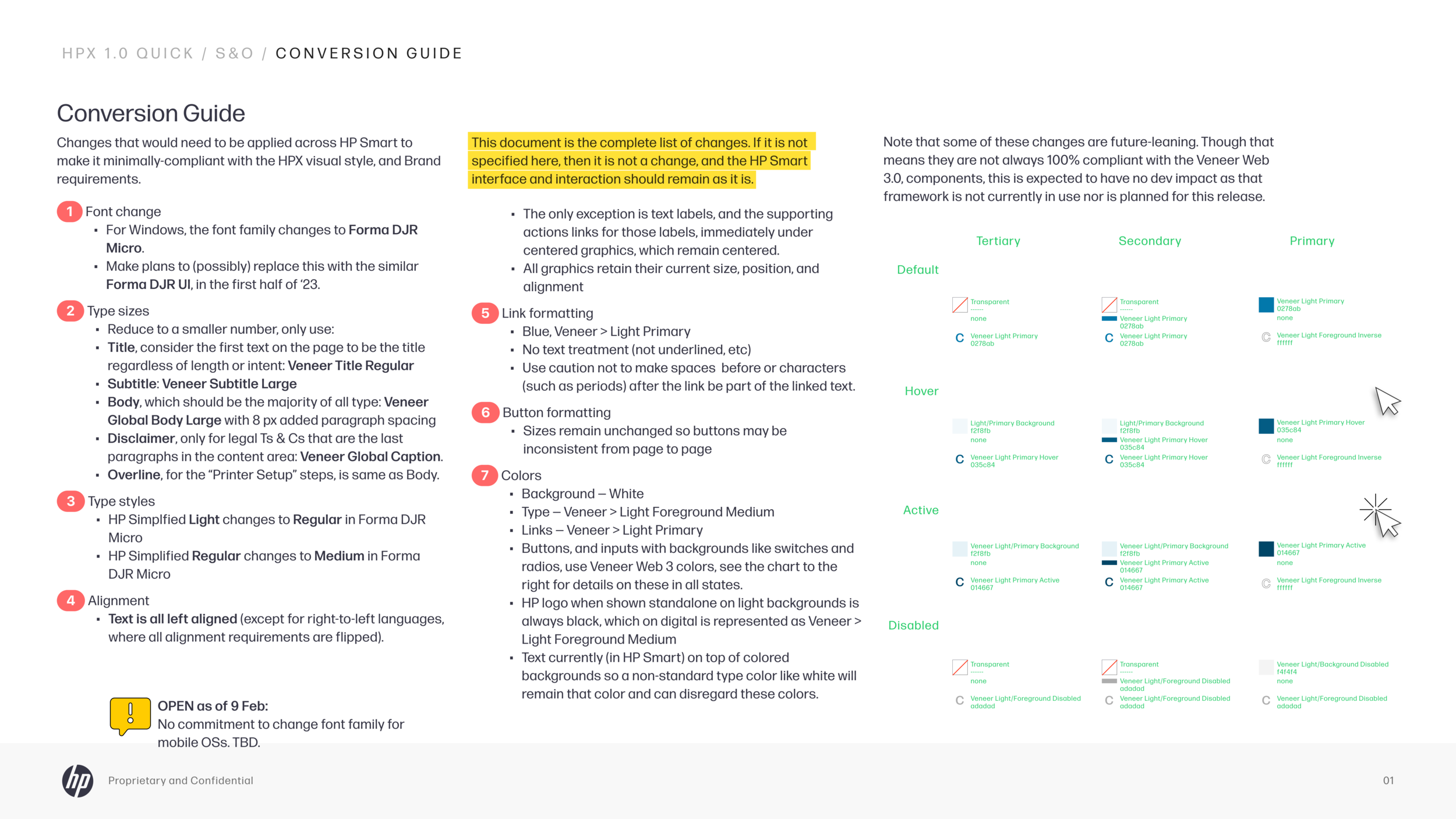
When it became clear that there were difficulties implementing a real new design, I proposed and created, mostly within a week, a Quick Conversion style guide, of 6 changes to bring all the disparate page designs into basic alignment. These included text alignment, text size changes, color changes and the like.

While supporting the Quick Conversion, I led (though did not manage) a team that created a series of design Libraries — design systems, with code widgets and all, but subordinate to the corporate design system and brand — to create a unified look and feel for this app made of disparate experiences from different departments.
We worked with many design teams and product managers in different departments to gather their requirements and their own design ideas using workshop methods, to create the unified design language for the whole new product.

Part of the design language for the entire application…

The same team building the library also created a series of future concepts, to be placed into a next-generation Library, to expand the product past the simple website-as-app concept, and make the customer experience much more engaging and seamless.