Design for Large Displays
Mobiles are not different from desktops because they are small but because they are connected and personal. Good products don't just meet a niche, but leverage the native intent of the interface. Lately, we have heard some gnashing of teeth as developers try to figure out how to make things that are useful for the Apple Watch. Meanwhile, users of Pebble wonder what the fuss is about as much has already been figured out regarding wearables.
Likewise, we have to design properly for large interactive displays. We cannot just present the same information we do on desktop computers or mobiles, make it really big and call it suitable for a large display. We have to understand the ways they are interacted with, and recognize large displays are public, and collaborative.
Control Methods
With the apparent ubiquity of the touchscreen smartphone, there's an assumption that all interactivity is touch. But really, there are several ways to control large displays:
Each of them has pros and cons, not just in price or suitability for installation, but in the way they encourage group observation, collaboration, sharing, engagement, and the detail of control input. Let's review each one in turn:
Remote Control

These days we remotely control much of the technology we surround ourselves with, but the first remote controls most people considered worth mentioning were used for controlling large displays. The basic pushbutton TV remote has much to teach us still. Good remotes are:
Individual — Only one person uses the remote at a time. Poor remote control systems allow multiple simultaneous input methods, and do not clarify when they are in conflict.
Responsive — When an input is performed, the remote indicates the control was sent, and the display device responds in a reasonable time. The response doesn't have to be completion of the request, just an indication that the request has started, and is being processed. Bad remotes have long delays.
Abstracted — The input method is indirect, so has to be abstracted at some level. There is no direct control, but a language of control imposed. Think of how channel changing on the classic old TV remote is up and down. Trackpads that try to allow direct mouse pointer manipulation work poorly because the pointing surface is moving, or at an arbitrary orientation to the display.
Of course, even TV remotes are becoming more complex, but the principle has been extended for many types of control, from industrial automation to collaborative public space wall displays. We can break down remote control into two basic categories
Fixed — Wall mounted units, kiosks, desktop computers and laptops since they are not really usable unless set on a surface. WHAT IT MEANS...
Portable — Simple pushbutton remotes, complex remotes with things like keyboards, smartphones and tablets with remote control apps on them. Gesture-enabled wands are discussed under Control at a Distance.
This section is notes and has to be completed as yet: multiple workspaces... can replicate on remote, or have separate control... upsides and downsides (reflect mirroring computer experiences like when you do not want the users to see everything, even as simple as notes for a presentation... )
Designing for Remote Control
Remote controls are unusual in that they are split in need, appealing to both very simple and very complex entry methods.
Remotes require physical contact with the remote control device. This may be difficult due to environmental conditions, fears of loss or damage, or other concerns. If so, consider one of the other methods.
Remotes are shared by physically handing control of the unit to another individual. This can have advantages and disadvantages in clarifying who has control, as well as the psychology of control.
Systems exist where there are multiple remotes attached to a single system. Limited or group remotes (such as classroom feedback systems) must be designed to clearly emphasize the hierarchy of control, and limits or capabilities of each type.
Don't make up your own control language. Use standard mappings when such abstractions already exist. Don't change channels by click left and right. Spinning controls increment clockwise and decrement counter-clockwise.
React instantly. It is okay if there are technical constraints on completing the request, but indicate the request has been received. Reflect inputs to the screen with indicators, or actually begin the action in a visible way immediately.
Control at a Distance

Here I mean direct control at a distance. Instead of using a remote intermediary, you gesture at the display unit (or an attached sensor) itself.
This actually can encompass "wands" or remotes like that used on the Wii, which assist with gestural sensing, but they are not very prominent anymore, with the advent of the Kinect there is no real need to hack those, when you can hack the direct gesture systems. The principles are similar, however.
The control systems work in two basic ways:
Gesture Language
Actions can be performed with simple gestures, or strings of them to form more complex commands, or series of commands. The gestures are generally not going to be very natural, so must be memorized. Typical users will not be able to memorize or apply more than a few gestures, so the design of the information has to be directed and simple.
Gestures are typically things like next, stop, back, details, options and so forth. This can be combined with other methods, such as voice control, to provide for input like typing which would be very difficult to perform otherwise.
Direct Manipulation
The other method is to use gestures to directly control elements on the screen, or to indicate them with a mouse pointer. This is the classic sci fi movie version of VR, and futuristic control systems of all sorts. The user grabs shapes, or moves the focus over a series of objects then indicates. Your first experience on many of these systems is exactly like this, as a virtual mouse is provided and you select options, type WiFi passwords and so on.
From this you may have noticed the key problem with it, that moving like this is tiring, and it is more tiring the more precision you have to use to make the system perform properly.
Designing for Control at a Distance
Aside from entertainment, this is best for assistive systems where the user's primary task is on another device, or is in a real environment.
Use these input methods briefly, or as short strings periodically. Allow the user to make a selection, or a gesture, then display information.
Huge benefits in environments where the user cannot or should not touch the display. Some interesting research is occurring in hospital operating rooms, but the next step will be mechanics, outdoors, and public access devices.
Be careful selecting gestures, to assure they are unambiguous, are not performed naturally so will only be used deliberately, and do not interfere with their primary job. In tests in the hospital setting, some gestures caused the surgeon to accidentally make contact with his upper body, violating sterile procedures.
Don't expect to be able to train for part time or brief-use. Museum visitors cannot learn a gesture language quickly enough for it to be useful to them.
You will have to reflect the input to the screen, which may distract other users of the system.
Very Coarse Control

Very coarse controls imply easy selection, and more forgiving — or cheaper — technology to sense touch. Compared to fine control, they are more suitable for casual interaction and may be more useful in public, collaborative spaces.
Very coarse can be defined as targets more along the sizes of the user's hand, with selectable areas from 4-12" in diameter. The large size will cause most users to engage with them at near arm's reach, so the resulting display should be designed for this larger field of view. Since the user is already back further than those engaged in fine control, even larger displays can be used, which require the user to step back slightly from the display to see it. A transition period of non-critical information should precede this to allow the user to recognize and adjust their position.
Very large targets may not appear to be interactive to many users as they are not able to use familiar paradigms of interaction. You may find it necessary to entice the users with animation, examples (the unit self-selects when idle) or to combine it with Control at a Distance methods, so some interactions are occurring just because the user walks by, or points at interesting information.
Designing for Very Coarse Control
Best for collaborative systems in public or group use areas.
Among the easiest to engage people with, as it is somewhat familiar (touching and directly interacting) but does not require the close approach of other systems.
Relatively inexpensive to implement as it can use machine vision (cameras) for interaction, instead of high-precision touchscreens.
Difficult to perform complex actions, so best used for selection then observation, such as combining datasets, selecting video to watch and so on. The presented information should be suitable for non-engaged observers.
Well suited to group use, and can either support multiple unrelated strings of information processing, or collaboration. Which one depends on the overall context and the users working with it.
Will be used for fairly brief times, possibly only one or two interactions. Presented information should be brief, and entice for further interaction, not just play and then remain static or return to the idle state.
Should be combined with Control at a Distance, leveraging the machine vision system to entice users or perform limited or different interactions based on proximity or remote gestures.
Don't expect to be able to train users on how the system works. Must be apparent immediately and not require instruction or guidance.
Fine Control Up Close
Large displays can be seen at a distance, and generally fall under the 10-foot-UI principles (meaning, assume users are consuming content from 10 feet away, vs arm's length or in the hand). But this is not fixed. Users can approach the display, and there may be advantages in allowing direct control of the interface from the large display.
Direct control here will mean touch. The touch technology used is not critical for the basic principles, but you should be sure to understand the impact each technology has on your design. Some do not work for multi-touch, or do not support gestures well, and target sizes (even though based on human physiology) are not the same for each technology.
Collaboration systems, especially, can benefit from use of large touchscreen displays. Various installations have had good results from allowing multiple users to organize cards at the same time, such as for sorting visual items, or creating shared task lists.
Presentations such as demonstrations can also use direct control of the display instead of canned or remote control driven responses.
A key problem with many of these systems or uses is that the person interacting with the display necessarily blocks some of the screen. While people are good enough at seeing around their own hand, it is much harder to do for those further away (partly due to parallax) and the user's body may also obscure the screen.
This is not different from the issues encountered with sharing on chart paper, on whiteboards, or even when presenting a slideshow. And these have lessons we can learn from. If it is critical that others be able to see the work while a single user is manipulating the display, consider use of an "on screen remote." An area near the edge can be designed to work at close range, and will encourage the controlling user to stand to the side of the display so their changes can be seen on the larger part of the screen.
Designing for Fine Control Up Close
Remember it is single touch use, but with many observers. This is unusual in that you have two simultaneous and often conflicting audience types.
Try to place controls near the edges, or otherwise so the touching user does not obscure the screen. This also allows the touching user to anchor their hand to the bezel for additional precision.
Remember the near user has a different view, so it may be necessary to provide a monitor (duplicate the large view) so they can get an impression of what the room sees. This can even include how much they are obscuring the screen, as a reminder.
Interactions that only matter to the touching user, such as button feedback, should not be so strong they are distracting to viewers.
If possible, make near-use functions disappear (or become less prominent) when no one is within touching range.
In some cases, more than one user may be touching the screen at one time.
Design this for the actual way it will be used. Is it only to be used up close, or will sometimes users step back to see the results, or share with the room? Considerations above still bear out, but can be more complex to develop as there may be no easy switch of modality.
Consider how engaging the interaction will be. If some users may wish to use the system for extended periods, consider providing alternative methods of interaction such as the same display on a tabletop with chairs, and the ability to rest the arm.
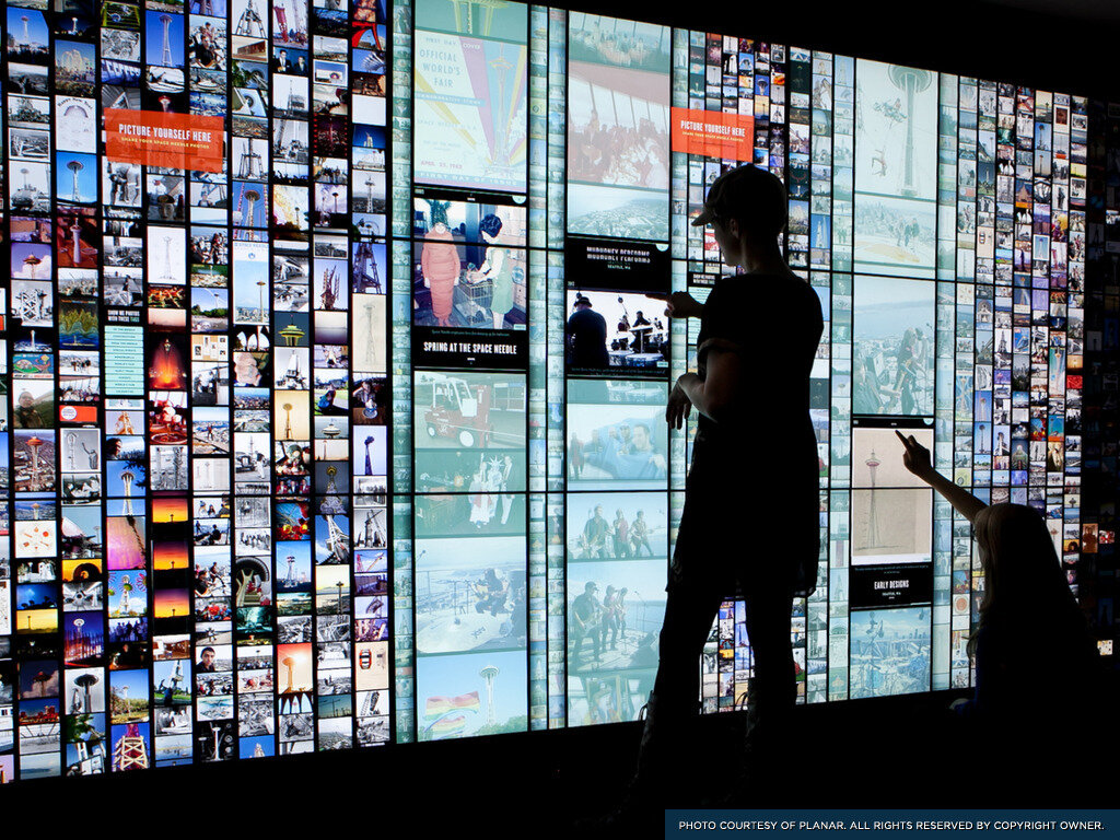
Public & Collaborative
More important than any technology or method of interaction is the fundamental truth that most large interactive screens are in public, and used collaboratively. Public doesn't have to mean literal free access, but just means not one-on-one as we are accustomed to with phones, tablets and computers. Large interactive displays are unlike desktop computers or especially mobiles due simply to their size. More often than not, the size is a direct offshoot of the specific need to be in public. At the lowest end of public we mean the TV in your home. Smart TVs mean someone controls a device which the whole family is observing.
Other cases such as museums, business contexts and so forth have the same basic issues as family Smart TV control. As single individual is in physical possession of the control unit (or has the focus of the gestural control mechanism) but may not be fully in control. He has to take input from the entire family, assure the group makes decisions, and make it clear what input he has requested of the device.
When designing for any of the control cases, two audience classes can be considered.
Group
Individual
And unusually, we do not just have to design for both audiences, but usually both experiencing some output at the same time. Let's look at some problems with this.
Feedback
Traditional input methods consider the controlling user, so when a selection is made feedback must be quick enough it is clear that the intent was executed. It doesn't have to take effect, but something must happen such as the button indicating click, a delay indicator, even just vibration and noise.
However, those not making the control inputs are slightly disassociated from the cognitive cycle. They may have requested an input, but only verbally. There may be competing requests, the controlling individual may have misheard, or ignored it, and time delays are much higher. The need is still there, so all users can orient themselves to the system properly.
Some systems, such as gesture based sensing, require feedback on the screen of the control. This is different than indicating focus or wayfinding, and the feedback may interfere with other users' ability to consume information. This may make some input methods less suitable for shared environments.
Wayfinding, Orientation and Notification
It also means that the feedback of interaction, has to be apparent to all users, not just the one controlling the system. Users not manipulating a system can easily loose their place even when paying some attention. This is easy to demonstrate; simply show someone how to use a mobile application with unusual touch controls, and then let them try to emulate the interaction. Since there (usually) is no on-screen feedback of touch, and their focus is on the screen instead of your fingers, they are not aware of how the system works.
So, it is important to remind and label. Use mobile paradigms and assume interruption and distraction. Label elements, position in the system, and provide methods to navigate away or higher. Use as few transient indicators as possible -- such as disappearing labels or blinking items -- as users may not focus their attention during the time the indicator is visible.
Focus
"No, no... go up one." We've all done that at home, or in a meeting, trying to get the controlling individual to play the right video, or interact with the right part of the system. But think about why we can do that. Only because we can see what is going on, due to indicators telling all observers what the user has in focus.
All collaborative large display systems need focus indicators, even those which do not require them for the controlling individual. Gesture based systems should have dots or some similar function to indicate taps, and these should have a delay (or ghosting effect) to make it clearer when previous taps, or gestures have occurred. Remember, people get distracted and may look away for a moment even if trying to pay attention.
Presentation
Certain systems will have to use these guidelines in a much more limited manner, as the displays are for presentation, instead of collaborative interaction. This includes large, collaborative spaces such as control centers, but consider the typical work process. Individuals have their own workstations, and carry out important tasks on them. Screens of the information they are seeing and working with can be mirrored (often by another individual) to the large displays, but this is just for presentation, so others can see the information and not for them to provide feedback directly.
If the cursor, or focus controls were visible at all times, this could be distracting, and make it difficult for others to glance up and get the information they need. It could also encourage detail collaboration, which would distract them from their own tasks and screens.
Similar issues arise in true presentation environments -- for work or entertainment -- or any time you wish the audience to focus on the content, not the process or your activities in presenting the content.
Conclusion
The fundamental lessons we have to keep in mind when designing for large, interactive displays are the same as for any interface. Consider context, user goals, and interactive methods and technologies.
With other devices, we can make pretty safe assumptions about the user in some ways. Desktop users are focused on the device, and sitting. Mobile users are distracted, and holding it. But large devices add two different facets we have not usually considered, posture and collaborative sharing.
Users might be standing, sitting, walking or doing any other activity, at any distance. You need to identify the user's position, distance and needs to help narrow down how your large display should present information and offer interaction.
Other types of design for interaction assume one user. Even if we design for many types of people, we do assume one at a time. Large displays have to assume multiple users are viewing, and possibly interacting with the system at once. They may have widely varying needs, goals and even capacity for interaction. You may need to address the needs of both users controlling the system, and others who view or collaboratively control it.
And lastly let's not forget basic guidelines on type size, contrast, viewing angle, language, comprehension, and other key human factors attributes still apply. Make sure whatever you design can be seen, read, understood, and used by all your users.
Next Steps
To proceed further with this, we need research. Here are some key things I would like to check out.
Position - I'll bet it changes due to device position, including distance, relation to eye level, and so on.
Anchoring - Touch seems to be greatly enhanced by anchoring (holding onto or bracing on the bezel) but let's measure how much since many of these cannot be used braced.
Gorilla arm - This is well known, but I am not sure it's well understood. We need to stop assuming, and measure how much of a problem it is, after how long. Does it only annoy and make people stop using, or does it reduce accuracy or have other direct effects?
Near/Far - Do small items for near use annoy and distract for distant users?
Pixel density - Some near guidelines may have to go back to old ones, like no italics, due to low density.
Focus - Do people in collaborative environments understand focus-free systems such as gesture-controlled ones?
If anyone has an installation (preferably within driving distance of Kansas City) where I can observe people or actually perform the research, please contact me so we can explore these open issues further.