1, 2, 3 For Better Mobile Design
This is an easily readable version of the deck I often present. It makes it easier to follow along for those whose first language is not English, and is otherwise an easy way to view the information without resorting to a slide show or waiting for video.

Good afternoon, everyone and thanks for having me!
I should say before we begin that if you don’t understand my English well — even if a native English speaker and I just talk too fast — I Will post this whole deck to Slideshare, BUT you can follow along right now with my speaker notes at 4ourth.com/123
But let’s get to it…
Slide #2

Mobile… is not… desktop.
We need to stop trying to squeeze 1990s Web 1.0 PC paradigms into our mobile app and websites.
We have to understand how people interact with small, touchscreen devices, so we can design them to work better.
Slide #3

Digital is simply NOT that young an industry, and need to stop using that as an excuse for bad behaviors, and flailing randomly about for solutions.
We’ve been selling online for over 20 years now. Well-done point-and-click interfaces — with pens and other devices but not unlike a touchscreen mobile phone — goes back to the 1950s.
A lot of the basics of software development, product design, and user experience design, all came from the post-war era, and are now older than almost anyone in the room.
We should know by now how to build good digital products on all platforms.
Slide #4
We don’t in large measure because we are pressured to live in a world that is all about speed and newness.
We work alone or in isolated teams, and make choices off off anecdote, and gut instinct, or let the boss impose whatever trend he just read about.
The best we hope for is to end up re-discovering the same stuff every three years.
But sometimes, we find the wrong thing, or we miss out until it is too late.
Slide #5

A few years ago, a Scaled Composited/Virgin Galactic SpaceShip2 broke apart in flight, killing one and seriously injuring another, entirely as a result of pilot error.
Except, headlines aside… not really. As the NTSB found and clearly stated, the manufacturer paid no attention to human factors, in training or the design of the controls, in crew procedures, or in ergonomics, so it was just a matter of time before someone pulled a lever at not exactly the right time, and people died.
They designed the system to be very robust and failure proof, but left out the person.
* People are the most unchanging and constrained part of your system. *
You cannot (generally) pick who your users are. You cannot modify people to work with the system better. Training, even for experts like test pilots, is only so effective and people fall back to their human ways very easily.
Slide #6

User Experience Design and Human Factors are the study and practice of the people side of systems. We use ergonomics, physiology, cognitive psychology, and ergonomics to understand how people work, and how they work with the systems we make.
To understand how people REALLY interact with mobile phones and especially touchscreens, I have personally done a lot of research, observing how people work with mobile devices in the real world.
And since then have designed many apps and websites that take advantage of it, and tested them. When you let me free on your website or app, we get things like TEN TIMES the conversions. Just making stuff work better.
I have spent my time since then writing about it, and debunking a lot of old, technology-centric understandings, and I’ll be sharing some of those findings with you.
Slide #7

In a minute.
Who hates it that clicking almost anything in Netflix starts playing the movie? That is because their goal is “getting more viewers,” full stop. This is the result of “A/B testing” and as much as you might hear how you need to start doing that it’s not really true.
Sure, it’s great to test, but they are using a small, bad offshoot of “Multi-variate testing.”
No test is complete when you do one round, and pick the winner, or ignore the tangential results; what if you raised close rate by 5% but also had 10% of users drop the service?
Be more like Edison, or Dyson with their thousands of experiments. You use the Scientific Meethod.
Slide #8
Until you get the BEST POSSIBLE result. When the improvements level off, or are so good they cannot be easily improved on.
All the "don't use hamburger icons" research is very, very narrow.
It is often from a single A/B test, that determined, FOR THEIR SITE or app, that tabs were better than a menu.
But Slightly Better, for one situation, is not The Right Answer for everyone. And maybe not for you at all.
Slide #9
This is another good example that is, I PROMISE, totally relevant to the topic at hand.
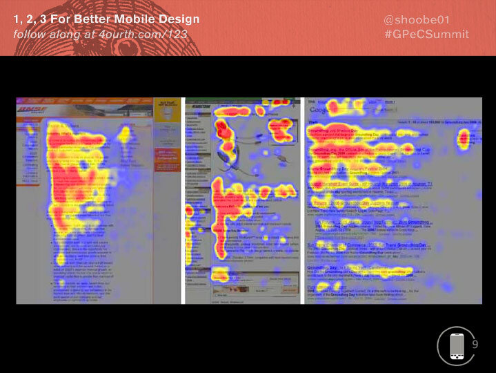
Who here has heard about the “F Pattern”? It’s supposedly the way people scan web pages.
It is essentially not true. It is One Way people scan web pages. There are several others, based on how your page is designed.
It’s a way of understanding what people do, not a goal because of intrinsic truth about humanity.
Somehow it got latched onto, and was misunderstood, and overly applied.
Slide #10

BADLY over-applied and misinterpreted.
Marketing folks, be careful reading these sorts of articles…
Slide #11

Because — for example — at least two of these three points are BAD THINGS. Don’t design your website to have them!
More importantly for us, it’s really only a desktop phenomenon.
https://www.nngroup.com/articles/f-shaped-pattern-reading-web-content/
Slide #12

Aside from misreading the research, it is way past time to realize that mobile is not a PC, and shoving your desktop web design into the app isn’t going to work.
Mobile is different.
— Mobiles are always on
— Always with you, and glanceable at a moment’s notice
— Full of sensors, so they know about you, and your current context
Expectations are different. Say you have a contact link on your website: Cheap and cheezy. Professional sites do contact forms.
But the opposite is true on mobile. The experience of intents — connecting multiple apps together — is so seamless that a link, which opens the email client, is the expectation and forms will be much less used.
The same is crucial for many other things. Your website better have a map for the store, but on mobile it should like to the preferred mapping app. This can also save you money!
Don’t just build your app or website, but zoom out a level: think of the customer experience on the platform, think of where they use the phone, and why.
Slide #13

You will start to see that building a page, or linking to another app is not a UI discussion.
It’s a structural one. What we call IA or Information Architecture.
And a lot of the issues we hear people having around making customers discover products on their eCommerce sites are trying to fix IA issues with UI solutions.
You can’t do that.
Slide #14

You totally can use a hamburger or dot menu.
I use them. It works great. I do testing of my apps, and get LITERALLY 100% of all participants to find the items I put there.
How?
Because I don’t hide key information under the menu. I have architected the structure of the website or app to let me put key functions Right in front of the user, and I can live with lower-use items that people expect to find, somewhere, under the menus.
Slide #15
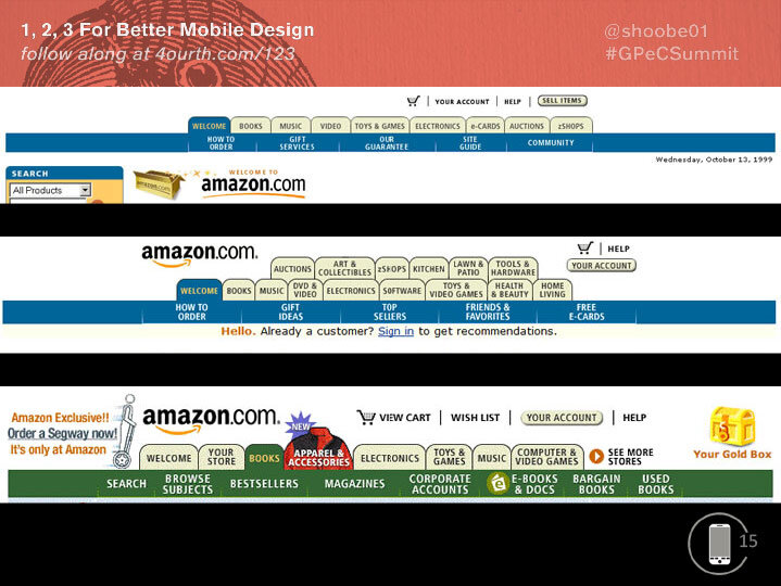
Tabs are often offered up as the Perfect Solution to the problems of Hamburger Menus.
But, they have issues also. And, we encountered these issues 20 years ago. This is Amazon trying their best to make tabs work over a 2 year period of experiments starting in 1999. Who is old enough to have an opinion about these stacked tabs when this was happening? RAISE HAND.
As they add categories (expanding from being a book and music store) they ran out of room, so do crazy things like stacking the tabs! Then, they end up with stuff like this (POINT AT LAST ONE), adding an overflow, or a Menu button in essence.
Mobile just makes this worse, as the small vertical screen means you will run out of room faster.
Slide #16

Now, enough of old websites, let’s get to the real info about mobiles.
There are LOTS of types of mobiles. Hardly half the world has smartphones, but since it’s going that way, and eCommerce in the West is largely about addressing smartphone users, let’s just assume that you all care about touchscreens.
And, that you build for Android first — as it’s 85% of the global market, close to that: 82% or so here*.
*(Romania, Mid 2019 via Statcounter)
Slide #17

Okay then:
Mobile is not read top to bottom, and really not in an F-pattern.
Content on mobile devices is read, and interacted with, from the inside out. The center gets the most views.
This is true for phones, and tablets equally.
Slide #18

So, you might think that when you copy the UI for something like this, the key controls are the actions and input at the top and bottom of the viewport.
[CLICK] but in fact the primary content and interactive area is the list in the middle of the page.
Slide #19

This is great!
We love list and grid views.
Just put your main content into them, in the middle of the page.
Make sure menu bars, tabs, and status displays and action items on the top or bottom are SECONDARY.
Think about how you use Twitter or Facebook or Email… you read the content in the center and May Sometimes compose new content, or go to another section using controls along the sides.
Slide #20

Not coincidentally, people are MORE ACCURATE when tapping the center of the screen.
There’s no bottom thumb sweep zones, no stretching the thumb.
Ignore the guidelines for a single very small size for touch targets: Apple’s 44 pixel doesn’t even make sense as it varies by device resolution! Fingers aren’t measured in pixels.
Ignore finger sizes, as size and accuracy are not the same thing. Accuracy doesn’t vary by finger size, but by context; you are much less accurate one handed, walking, and carrying stuff.
More accuracy in the middle means you can put lots of stuff in that list in the center.
At the edges, you can put A FEW functions, tabs, etc. as people cannot hit them as well.
Slide #21

Based on these findings especially…
…I have come up with a three tier hierarchy to make this all simple to remember, and apply to your designs.
1, 2, 3…
Slide #22

Just put your primary content in the middle
Secondary information or controls VISIBLE along the edges as buttons or tabs
Tertiary items are HIDDEN in menus in the corners
…
When architecting your app or website, just take all the content and functions, and rank them:
1, 2, 3
Slide #23

Youtube really believes this. Check out this more complex page, with not just a single list of content, but several, even CATEGORIES, which many of you care about, and we’ll see more of in a moment.
They trust that the center is the best place to look, and that people scroll and understand subsections.
They didn’t add sub-tabs or pulldowns or menus or anything else that makes it more complex.
Slide #24
Most often after we discuss the information above people ask me how SHOULD they make their categories visible if you can’t use tabs and hamburger menus are only good for expected sections.
Well, put them in the middle of the page.
If the main thing you want people to see is the menu, then it goes in the center of the page. Your content is your menu.
Also, it is important to understand your users, and not think like yourself. Most visitors — to most sites at least — do not come to the home page and then drill down by categories. They arrive by search, by referrals, even by links from your promotional emails or social media.
You have to design the IA to reflect how people really work.
Slide #25

What I mean is that you cannot solve your biggest design issues at the page level.
You have to know how people get into product, to design the IA to reflect how people really work. So, you should spend a lot more time on your category labels, and other hints about which section customers are in — a practice called “wayfinding” — or offering things like related products.
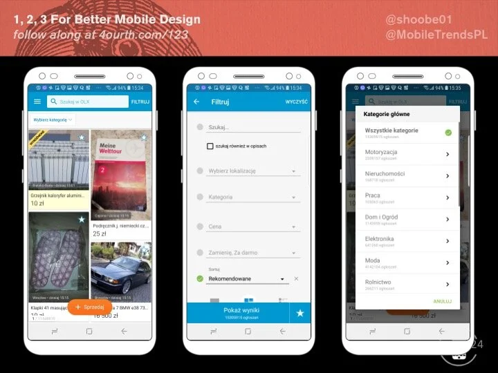
For example, OLX always leads with categories as part of the title. Not enough people do that.
Slide #26

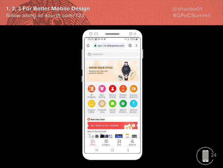
While we’re talking about fixing problems for the way users work: Stop annoying them.
The Aliexpress website regularly intrudes on the user flow, and ruins the 1,2,3 structure by adding a call to action to use the app.
People visiting by the web probably do not want the app, so need the best web experience instead.
In fact, it annoys people — driving them away, more than it is successful. Give them info to be helpful, but not intrusive, don’t make your goals more important than theirs, and don’t keep bugging them about it.
Slide #27
Before we leave this example, let me talk about the docked headers and chyrons, as shown here.
The content scrolls but this stuff stays in place forever so the user can get to it when they need to.
Slide #28

OLX doesn’t think they need one. But… as I scroll… some buttons appear at the bottom.
But who will scroll to the end of every page? And other functions are strewn around the page so may also be missed as users don’t know all the options available.
Better would be a chyron, a fixed bar with all that info in one place.
Want to drive the next action: you have to let people know the action exists at all!
Slide #29

eMag has banners all over, as we’ve discussed, but they know people scroll.
If I didn’t say that yet: People Scroll. Never fear “The Fold” as you don’t know where it is, so cannot design for it. Just make sure it looks like your site has more stuff below and people will scroll.
Anyway, they have a few key bits of information, and then as you scroll you see actual products in little horizontal lists.
Slide #30

The center of the eMag home page is a pattern I like the call the Category Carousel.
Netflix… and the Google Play Store… like many media companies put summary categorized /content/ in the center of the page.
This is one of my favorite methods of exposing and drilling down at the same time. I use it for much of my eCommerce work. It is starting to make inroads in eCommerce, but I think could really help a lot.
If not following: each row is a category. Explained less with the title than with the example content. Arranged, so the right side is cut off to make it clear without any icons, there’s more there. Scroll to browse items in subcategories directly ON The Home Page.
Yes, you can click to go to category pages as well.
Slide #31

…
You can try this yourself:
Architect a solution, from the data structure on up, instead of doing UI design first.
Make templates that support that, with key info in the MIDDLE of every page.
Use “drilldown,” instead of relying on any magic navigation as the primary way for users to move around inside the app.
Add secondary and backup functions and status like the cart, and search, along the edges. And post your results. Tell us how it goes if your boss will let you!
Slide #32

Within what you control, just always remember to design for hands, fingers, thumbs, and PEOPLE.
Slide #33

You can follow these links to see all that I have written about, including more on the topics I covered today.
Slide #34

You can read about my touch research, or buy a Touch Template to test out how touch-worthy your designs are.
Slide #35

And feel free to find me on social media, email me, and ask for these links, or ask questions.
I also do UX design and consulting, so if you need help with making your app, website, service, IOT product or anything human-facing better, talk to me about it.
TIME FOR QUESTIONS?
I will be here for the rest of the conference, so feel free to find me in a meeting room or hallway then as well.
Steven Hoober